Type Foundations
More than 90% of online information is text - which means that when you design an interface, you're mostly designing type. It isn't a finishing touch laid over the "real" design; for most screens, it is the design. Every word you read - from a cereal packet to a transit poster - was set by someone deciding which letters to use and how to arrange them.
Learn on the move: press play and turn your commute, walk or drive into time that grows your design career.
Listen to the full Type Foundations course on DesignPath
Typography
Typography is the craft of choosing typefaces and arranging them so text is easy to read, easy to use, and pleasant.
Done well, it goes unnoticed: it does its job by getting out of the reader's way. Done badly, it's felt before it's understood - as tiredness, hesitation, or a vague sense that something is harder than it should be.
Type doesn't just carry words - it does two things at once, and both happen before the reader has consciously read a sentence.
Drives usability.Well-set type does quiet, measurable work: it guides attention, reduces the effort of reading, and keeps people moving toward what they came to do - which is why good typography lifts comprehension and conversion alike.
Carries brand voice.Type speaks before the words do. A typeface sets a tone - trustworthy, playful, premium, technical - and shapes how a brand feels before a single word is read. This is what separates a confident first impression from a forgettable one.
Typefaces & Fonts
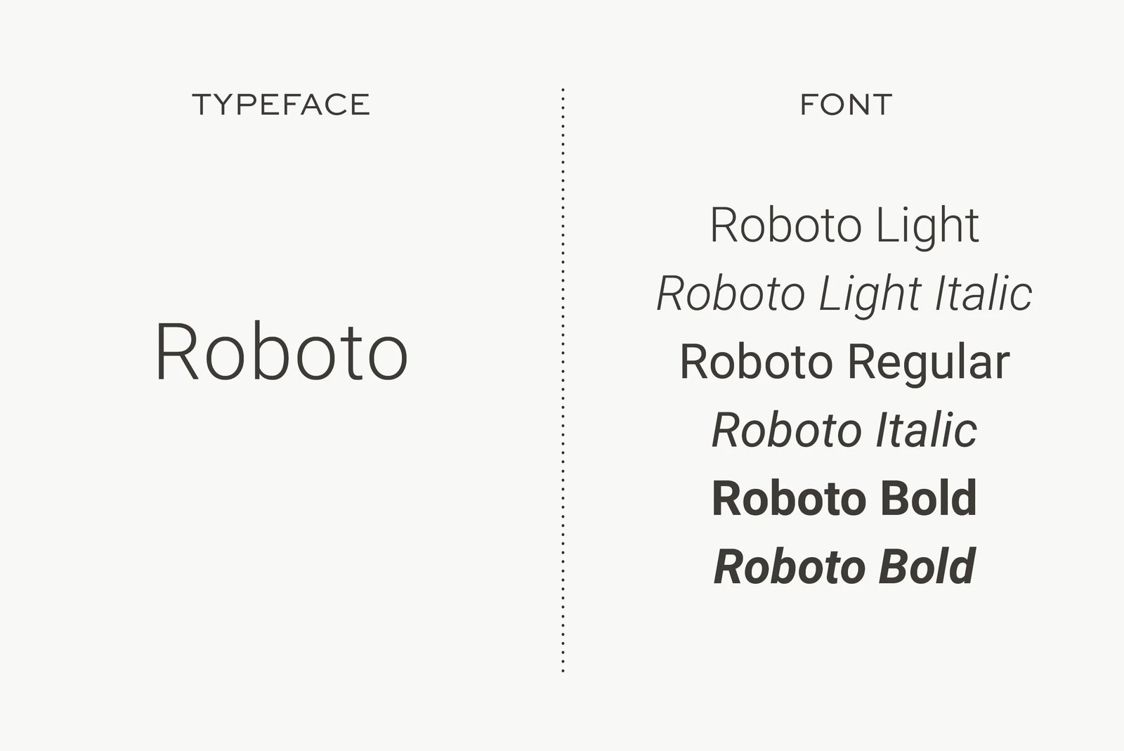
Five words get used interchangeably in design conversations - typeface, font, family, weight, style - and all five mean different things. Getting them straight lets you talk precisely, read font documentation accurately, and understand why two typefaces set at the same size can look completely different.
Typeface
A typeface is the design of a character set - the visual identity of the letters. Helvetica, Inter, and Garamond are typefaces. The word comes from print, where it referred to the face of the metal letter block.
Choosing a typeface is the first decision that sets the tone, because it carries a personality before a single word is read - which is why brands guard their type as carefully as their logo.
A typeface comes as a family - the named collection of all its weights and styles. Inter is a family; Inter Bold 700 Italic is one font within it. Most design work draws from one or two families: that's what keeps a layout coherent without effort.
Font
A font is one specific instance of a typeface: family + weight + style + size. Inter Bold 700 Italic at 16px is a font. You choose a typeface, then you use a font.
In the metal-type era this was literal - a "font" was one physical drawer holding letters of a single size and weight.
Weight
Weight describes how heavy the strokes are. Weights run from light to heavy, often written as numbers:
- Thin - 100
- Light - 300
- Regular - 400
- Medium - 500
- Semibold - 600
- Bold - 700
- Black / Heavy - 900
Heavier strokes create a darker overall "color" when set as a paragraph - a Bold paragraph looks visibly darker on the page than a Regular one at the same size.
Regular carries body text comfortably; Bold pulls the eye to what matters most; the extremes - Thin and Black - work only at large sizes, where their drama reads clearly but fall apart in small body text.
Weights and styles can be combined: Medium 500 Italic, Bold 700 Condensed.
Style
Styles are drawn variations applied across a family's weights. The three you'll use most:
- Italic - letterforms redrawn from scratch, not just slanted; typically more compressed and angled. Used for softer emphasis, titles, or foreign terms. Because the letterforms are redrawn rather than slanted, italic text has its own texture that distinguishes it from regular without shouting the way bold does.
- Oblique - the roman letterforms mechanically slanted, not redrawn. Looks similar to italic but shares the same skeleton as the regular weight. Common in geometric and grotesque sans-serifs (Futura Oblique, Helvetica Oblique). The distinction matters when you need true italic drawing - oblique is a shortcut.
- Condensed / Narrow - letters drawn tighter horizontally so more text fits in less space. Useful for dense labels, navigation, and data tables, but tiring to read in long passages.
Pro tip: To check whether a typeface has a true italic or just an oblique, look at the lowercase a and g. A true italic redraws both completely - the 'a' often drops to a single-storey form, the 'g' simplifies. An oblique keeps the roman shapes and just tilts them. Most tools label both as "Italic," so you have to look.