Communicate with Typefaces: History, Mood & Connotation
Movable type was invented twice. The first time was in China around 1040, by a commoner named Bi Sheng who pressed individual characters into clay and fired them. The second time was in Germany around 1450, by Johannes Gutenberg - a goldsmith who cast individual letters in lead and assembled them into pages that could be printed, disassembled, and reassembled for the next job.
Learn on the move: press play and turn your commute, walk or drive into time that grows your design career.
Listen to the full Communicate with Typefaces: History, Mood & Connotation course on DesignPath
Gutenberg's version changed the world more dramatically, and not because it was more clever. It arrived in a continent about to enter four centuries of religious and political upheaval, with a merchant class hungry for cheap books and a Church about to lose its monopoly on their production.
The Press and Its Vocabulary
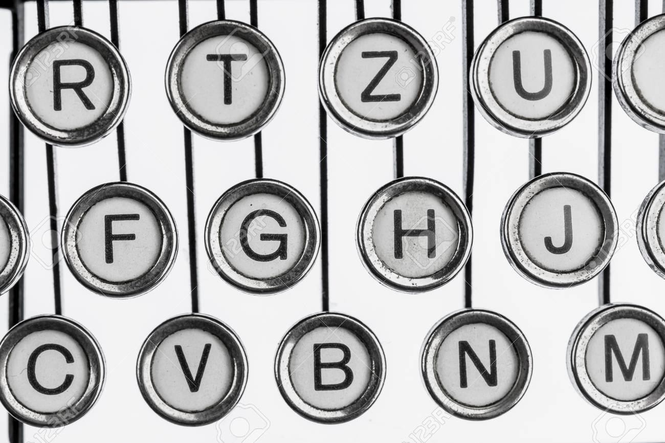
A letterpress compositor worked with a California job case - a wooden tray divided into compartments, each holding a single letter cast in lead. The capital letters lived in the upper case of the tray; the small letters lived in the lower case. That is where the terms come from.
Each letter was cast on a metal block called a body. The width of the body gave us the em - originally the width of the capital M, which in most typefaces filled its body completely. The height of the body gave us the point.
Between lines of type, the compositor placed thin strips of lead to add space. That is leading. The word is still in use in every design tool; the practice it names is two centuries old.
A font was a single physical drawer: one typeface, one weight, one size. If you wanted 12pt Garamond Regular, that was one font. If you wanted 14pt Garamond Regular, that was a different font. You couldn't scale type on a press - each size was a separate set of physical objects.
Phototypesetting and Digital Type
The letterpress era ended gradually in the mid-20th century, replaced first by phototypesetting - projecting letterforms from film reels onto photographic paper. Phototypesetting unlocked tighter spacing than metal allowed and opened the door to the visual experimentation of 1960s and 70s graphic design. It also introduced new problems: spacing that was now too tight, letterforms designed for one medium misused in another.
Digital type arrived with the personal computer. OpenType and TrueType fonts are vector files carrying embedded kern tables, which are spacing adjustments for specific letter pairs, and hinting instructions for rendering curves on low-resolution screens. Newer fonts add axes for continuous variation of weight, width and optical size. A variable font is a single file containing not one style but an entire design space.
Why the History Matters Now
When a designer opens Figma and adjusts leading, they are doing what a compositor did with lead strips in 1600. When they kern a specific pair of letters, they are applying the same judgment that type designers have always applied to problem pairs. When a designer adjusts leading in Figma, they are naming a physical object - strips of lead placed by hand between rows of cast type. The word is the thing. Knowing where it comes from is knowing why the tools behave the way they do, and why the numbers that feel right in practice have always felt right.
Gutenberg, famously, designed his type to imitate handwritten manuscripts - to feel familiar and prestigious to a readership that associated books with the church's hand-copied texts. He even created dozens of slightly different versions of each letter to simulate the irregularities of handwriting. His instinct was the same one that drives type design today: new technology works best when it meets its audience where they are, before it asks them to go somewhere new.
Humanism vs. Rationalism
There is a question underneath every typeface choice: is the human hand visible in these letters, or has it been deliberately erased? The answer determines how the type feels - and it has determined that consistently for five hundred years.
This is the axis between humanism and rationalism. It is not the same as serif vs. sans. There are humanist sans-serifs and rationalist serifs. The distinction goes deeper than the presence of a finishing stroke. It is about where the letterform comes from: the pen, or the ruler.
The Pen: 1495
In Venice in 1495, the publisher Aldus Manutius commissioned a type designer named Francesco Griffo to cut the typeface for a small book by Pietro Bembo. The result - later named Bembo - was drawn from the calligraphic tradition of southern European scribes. The axis of each curved stroke is angled, tracing the angle at which a broad-nibbed pen would have been held. The stroke modulation is soft, reflecting the pen's natural thick-thin variation. The serifs are bracketed, curving gently where they meet the stems.
The humanist tradition had arrived. These letterforms did not look like machines had made them, because nothing like a machine had made them. They looked like letters written by a person - because that is precisely what they were derived from.
Humanist type has dominated long-form reading ever since. Garamond, Caslon, Bembo, Palatino - warm, highly readable, carrying the trace of the hand. In the 20th century the same philosophy produced the humanist sans-serif: Gill Sans, Frutiger, Myriad. The serifs are gone but the angled axis remains, and with it the warmth.
The Ruler: 1692
In 1692, Louis XIV commissioned a new typeface for the Imprimerie Royale - the royal printing office. It was designed not by a calligrapher but by a committee of the Académie des Sciences, using a mathematical grid of 2,304 squares. The result, the Romain du Roi, has a vertical axis, high stroke contrast, and serifs that meet the stems at right angles. Louis kept it for royal use exclusively - no other printer could use it.
This was the first explicitly rationalist typeface: letters derived from geometry and engineering logic, not from the movement of a hand. The pen had been set aside. The committee was making a political point as much as a typographic one - that France's printing was modern, scientific, and superior to the handcraft tradition.
A century later, Firmin Didot in France and Giambattista Bodoni in Italy pushed rationalism to its logical extreme. The Didone faces - named for both designers - have near-vertical axes, stroke contrast so extreme the thin hairlines vanish at text sizes, and serifs that are completely unbracketed: they meet the stems at sharp right angles with no curve. Beautiful at large display sizes. Demanding, cold, and fragile at small ones.
The Manifesto: 1927-1957
In 1927, Paul Renner designed Futura - the Bauhaus type. Pure geometry: the O is a circle, the A is a triangle, the stems are rectangles. The held pen is not just absent; the design is a statement that it should be absent. Renner was part of a generation that believed the future belonged to machines and that decorative historical forms were nostalgic baggage.
Jan Tschichold made the argument explicit in 1928. Die Neue Typographie - The New Typography - was a manifesto that argued for sans-serif type as the natural medium of the modern era. Serifs were the past. The axis of humanist type was the axis of the church, the guild, the manuscript. The new typography would be universal, impersonal, and built for the machine age. This was not just an aesthetic position. It was a political one.
In 1957, Eduard Hoffmann and Max Miedinger released Helvetica. Neo-grotesque, designed to be completely neutral - to transmit content without expressing anything. By the 1970s it was the visual language of American corporate culture. By the 1980s it was so common that neutrality had become corporate in its own right. Helvetica, the typeface designed to mean nothing, had come to mean something very specific.
The Return: 1975-Now
Adrian Frutiger designed his eponymous typeface in 1975 for signage at the new Charles de Gaulle airport. Airports need type that reads at distance, under stress, for people in a hurry. Frutiger went back to humanist principles - angled axis, open apertures, letterforms that trace the pen - and produced a sans-serif warmer and more readable than Helvetica. Healthcare systems across Europe adopted it. The NHS built their identity around a custom Frutiger derivative for exactly this reason.
Inter, designed by Rasmus Andersson and released in 2016, is the humanist sans of the screen era: large x-height, open apertures, designed specifically for legibility on pixel grids. It is in millions of digital products. The pen is still there, translated into software.
Why It Matters Now
When a designer reaches for Inter or Frutiger for a healthcare interface, they are making the same choice Griffo made in 1495 - the held pen, the angled axis, the human warmth. When they reach for Futura or Helvetica for a modernist brand, they are making the same choice Renner made in 1927 - the ruler, the geometry, the deliberate erasure of the hand.
The feelings these typefaces produce are not accidental, and they are not arbitrary. They are the accumulated weight of the philosophy that made them. Knowing the philosophy is knowing why the choice feels right.