Typography Scale, Hierarchy & Readability
Typography has rules that look like taste but aren't. Whether a layout reads well, whether the eye knows where to start, whether a paragraph feels inviting or exhausting - these aren't subjective. They trace back to four principles that apply across every typeface, every medium, every context.
Learn on the move: press play and turn your commute, walk or drive into time that grows your design career.
Listen to the full Typography Scale, Hierarchy & Readability course on DesignPath

Legibility and Readability
These two terms are often used interchangeably, but they describe different things.
Legibility is whether individual letterforms can be distinguished from one another - a property of the typeface itself. A typeface with low legibility has letters that look too similar (a lowercase l that reads as a 1, an O that reads as a 0), or proportions that collapse at small sizes. Legibility is a quality of the type design, not the setting.
Readability is whether a block of text can be read comfortably over a sustained period - a property of how type is set. Line length, leading, contrast, alignment, and paragraph spacing are all readability decisions. A highly legible typeface set with 100-character lines and 1× leading will be unreadable. A typeface with moderate legibility, set well, will read easily.
The distinction matters in practice: legibility problems are solved by choosing a different typeface; readability problems are solved by adjusting how the type is set. Confusing the two leads to changing typefaces when the problem is actually spacing, or adjusting spacing when the typeface itself is the issue.
The four principles below are all in service of readability - and readability assumes a baseline of legibility. Get both right and text becomes invisible in the best sense: readers follow the content without noticing the type.
Hierarchy
Hierarchy tells the reader where to look first, second, and third. Without it, every element competes for attention and the reader has to do the work of figuring out what matters - which most readers won't bother to do.
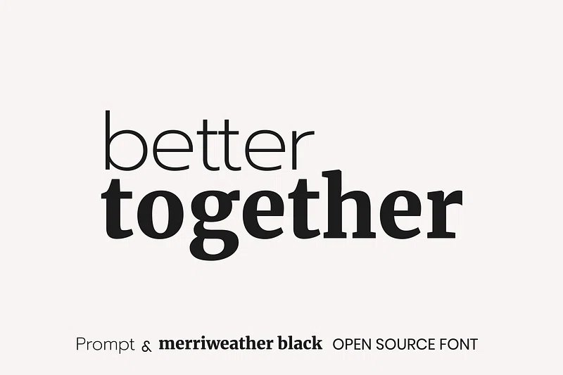
Hierarchy is built from contrast: one element looks visually heavier or larger than the next, so the eye lands on it first. Size is the most direct tool (a 48px headline outranks a 16px body), but weight, spacing, color, and case all create contrast too. The principle is the same: the most important thing should look the most important.
The mistake is building hierarchy out of too many levels. Three clear levels - primary, secondary, body - is almost always enough. Add a fourth and fifth and the distinctions between them collapse, taking the hierarchy with them.
Contrast
Contrast creates meaning. Bold text only stands out if the surrounding text is not bold. A heading only reads as a heading if the body beneath it is visibly different. A label only registers as secondary if it looks smaller and lighter than the content it labels.
This is why restraint matters. Use too many weights, sizes, or styles and the differences cancel each other out - nothing stands out when everything is trying to. The effective range of contrast in a layout is narrower than designers tend to assume.
The rule: one thing carries the contrast, everything else holds still.
Proximity
Proximity is how typography communicates relationships without words. Elements placed close together read as related; elements set apart read as separate. A heading close to the paragraph below it belongs to that paragraph. A heading with equal space above and below it belongs to neither.
This sounds obvious, but it's one of the most commonly violated principles in practice. Designs that feel vague or hard to navigate often have proximity problems - captions floating away from their images, labels drifting from the fields they label, section breaks that don't register because the spacing is the same everywhere.
Space is not decoration. It's structure.
Rhythm
Rhythm is consistency over time. A reader moving through a layout builds expectations - this is what a heading looks like, this is what body text looks like, this is how much space appears between sections. When those expectations are met, reading feels effortless. When they're broken arbitrarily, something nags.
Typographic rhythm comes from making the same decisions the same way throughout a layout: consistent leading, consistent spacing ratios, consistent use of weights and styles. It doesn't require rigidity - variation within a system is fine. What breaks rhythm is variation without reason: the stray heading in a slightly different weight, the caption set a point larger than the others.
The reader never consciously notices good rhythm. They notice its absence.
Paragraphs
Nobody reads a wall of text. This isn't a complaint about attention spans - it's how reading has always worked. The eye needs structure: a place to start, a natural pace, clear signals about where one idea ends and another begins. Paragraphs provide all of that. Get them wrong and the content disappears regardless of how good it is.
Line Length
Keep body text lines to roughly 50-75 characters including spaces - about 8-12 words per line. The rule exists because of what happens at the end of each line: the eye has to travel back to the left margin and find the start of the next line. Too long, and it loses its place mid-journey. Too short, and it's snapping back before it's settled into any reading rhythm at all.
The sweet spot feels comfortable without the reader noticing it. Discomfort at either extreme is immediately noticeable.
Line Height
Line height - called leading in print, after the strips of lead printers once slid between rows of type to add space - should sit around 1.4-1.6× the font size. At 16px, that means 22-26px. Too tight and adjacent lines bump into each other visually; too loose and they stop reading as one continuous block.
Large text, which readers process more holistically, tolerates tighter leading. Small text, which demands more decoding, needs more room. The relationship between size and leading is not fixed - it's a judgment call made by looking, not calculating.
Paragraph Spacing
A gap between paragraphs signals that one idea has finished and another is beginning. Without it, a sequence of paragraphs blurs into a single undifferentiated mass and readers lose their place the moment they look away.
The spacing should be clearly larger than the line height - not by a pixel or two, but noticeably larger. A common starting point is 1× the font size as paragraph spacing: 16px text gets 16px between paragraphs. More is often fine. Less reads as a line break rather than a paragraph break.
Alignment
Left-align body text. The left edge gives the eye a fixed anchor to return to at the end of each line - a consistent wall it can find without searching.
Justified text (stretched to fill both margins) was the typographic standard in print for centuries, where tight column widths and careful manual spacing kept rivers of white space under control. On screen, with variable column widths and no manual intervention, justified text creates uneven gaps that ripple down the column and make reading harder, not easier.
Center alignment works for short standalone elements - a pull quote, a hero headline, a toast notification - but not for anything that runs longer than a line or two. The ragged left edge forces the eye to search for the start of each new line.
Paragraph Length
Keep paragraphs to one idea. In practice, that tends to mean two to four sentences. Short paragraphs are easy to scan; they give readers anchor points to return to after they've looked away. Long paragraphs get skipped.
A well-structured body of text moves the reader through ideas at a rhythm that feels manageable. The visual breath between paragraphs is part of the reading experience.