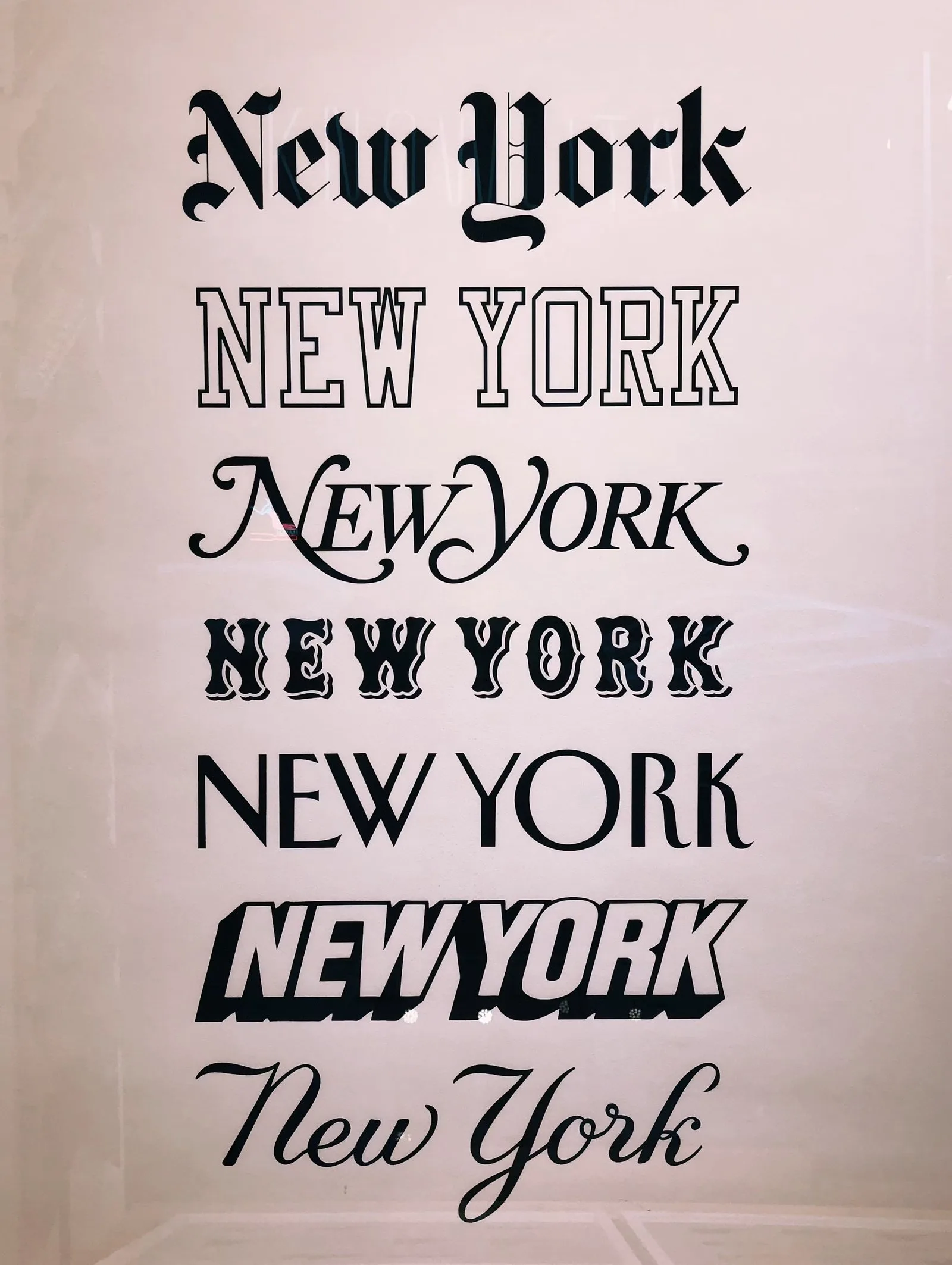
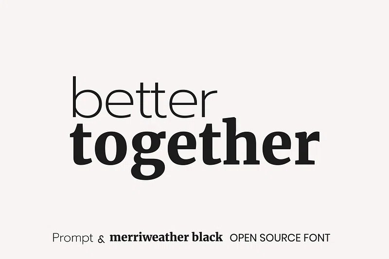
Expressive Typography: Branding, Posters
Everything in the previous four modules was in service of the reader. Legibility, hierarchy, spacing, the right typeface for the right context - all of it aimed at making the type invisible, so the content could come through without friction. Good denotative typography goes unnoticed.
Learn on the move: press play and turn your commute, walk or drive into time that grows your design career.
Listen to the full Expressive Typography: Branding, Posters course on DesignPath
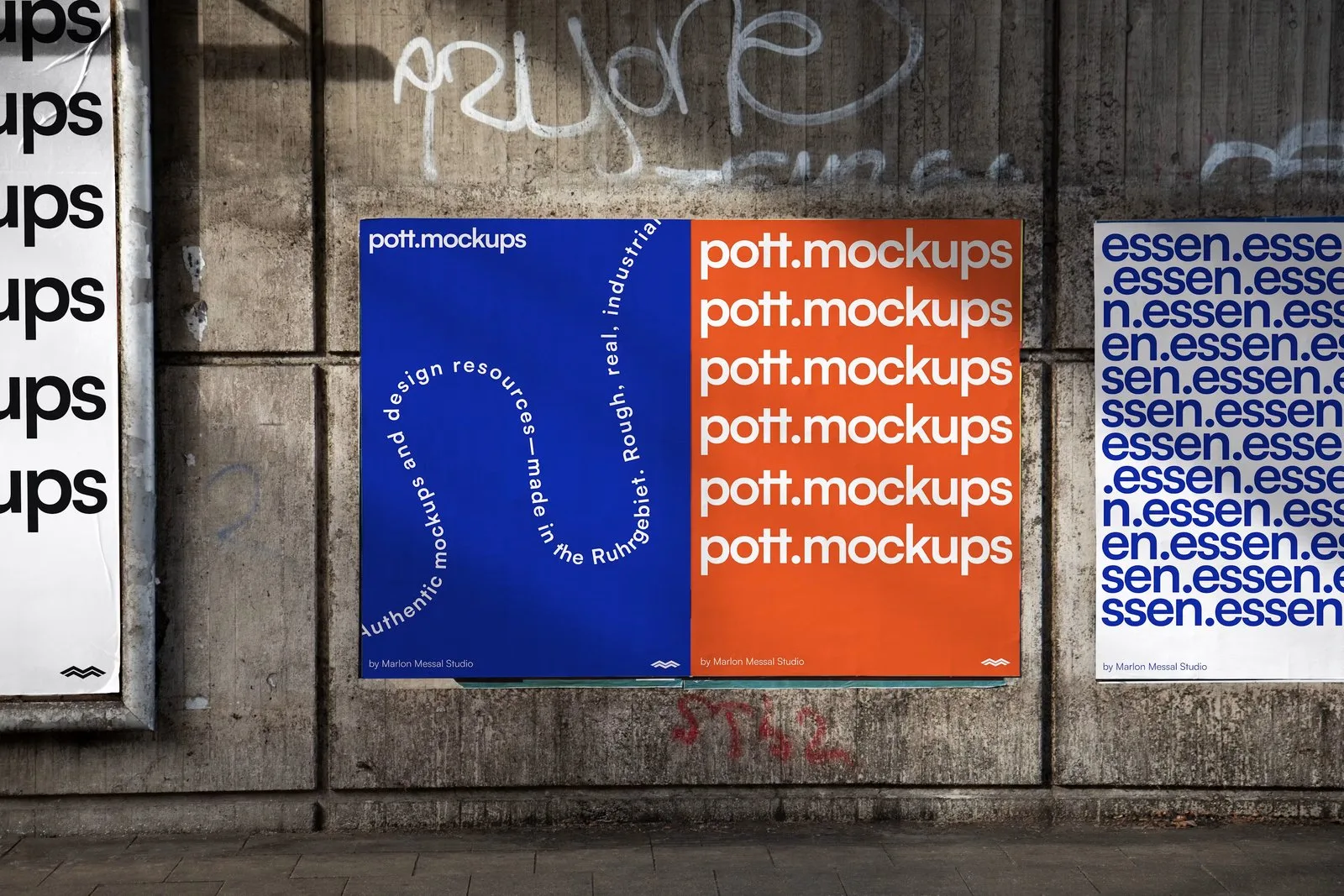
Expressive typography operates differently. The type does not disappear. It participates. The visual treatment of the words reinforces, deepens, or sometimes challenges the meaning of those words - and the form becomes inseparable from the content.
Denotative and Expressive
A newspaper caption is denotative: it communicates as efficiently as possible and asks nothing of the reader beyond reading it. A poster for a jazz festival where the letterforms are loose, improvisational, and slightly off-grid is expressive: the type itself is doing some of the jazz.
The distinction is not a hierarchy. Denotative typography done well is as demanding and as skilled as expressive work. A beautifully set novel page asks as much of a designer as a festival poster. The distinction is about the job the type is doing - whether it is serving the content or contributing to it.
In expressive work, there are no best practices. The only measure is whether the intended meaning reaches the audience. Everything else - rules about legibility, contrast, hierarchy - becomes a starting point to work from or against, depending on what the work needs.
When It Earns Its Place
Expressive typography earns its place where the form of the content is itself meaningful: posters, book covers, editorial spreads, album artwork, title sequences, motion graphics. These are contexts where the reader has already decided to engage, where a moment of interpretation is part of the experience, and where personality serves the work.
It earns nothing in a product UI, a legal document, a data dashboard, a science textbook, or any context where the reader needs information and needs it without friction. In these contexts, expression is interference. The designer's job is to disappear.
The skill is knowing which situation you're in - and within the expressive contexts, knowing what the content needs the type to do, rather than what the designer finds interesting.
Expression Through Typeface Variables
Before touching anything, identify the emotional core of the content. Not a reference image, not a typeface you admire - a feeling. Name it specifically: urgent, oppressive, nostalgic, clinical, tender, loud. The more precise the description, the more clearly it can drive every decision that follows.
Know Your Variables
Six variables carry expression in type:
- Typeface - the baseline personality (humanist warmth, geometric precision, historical weight)
- Weight - heavier reads as more forceful; lighter as more delicate or refined
- Case - all-caps is assertive and impersonal; mixed case is conversational
- Tracking - tight feels compressed and urgent; open feels calm or ceremonial
- Arrangement - symmetrical reads as stable and formal; offset or angled reads as tense or energetic
- Size contrast - dramatic size differences within a title amplify hierarchy and aggression; subtle differences read as considered
Push Them in One Direction
The key principle: all variables should reinforce the same direction. A treatment where the typeface says "aggressive" but the tracking says "calm" and the arrangement says "formal" produces a confused signal. Expression works when every dial points the same way.