Surveys
A survey reaches hundreds of people in a day, and one badly worded question can make every answer wrong. Imagine a team that asks "How much do you enjoy our new invoice editor?" and reports that 81% enjoy it. The question assumed the enjoyment, so the number says little about the editor.
Learn on the move: press play and turn your commute, walk or drive into time that grows your design career.


That's why a survey is built with as much care as the screens it asks about. Each question has to mean the same thing to every person who reads it.
One Survey for the Invoicing App
The lessons follow one survey for an invoicing app used by about 20,000 small businesses. The product team wants to know how many accounts also track invoices in a spreadsheet, and why some accounts create invoices they never send.
So the survey goes to 3,000 accounts picked at random from the product data. It ends with 396 usable answers, and every lesson works with those same answers.
Anatomy of a Survey
A survey that opens straight on its hardest question loses people on the first screen. Imagine an invitation that leads to "Rate the following twelve statements" with no word about who is asking or how long it takes.
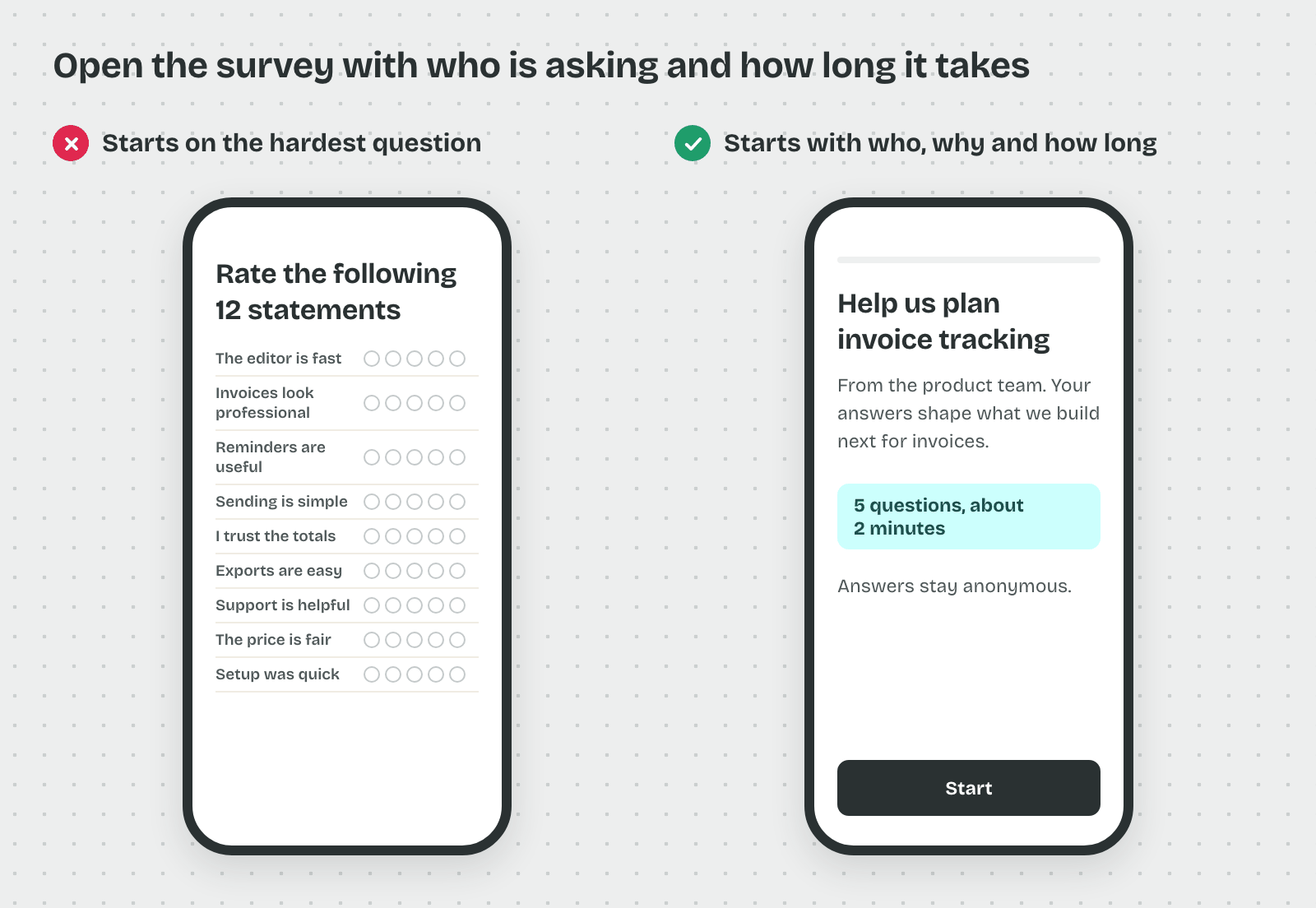
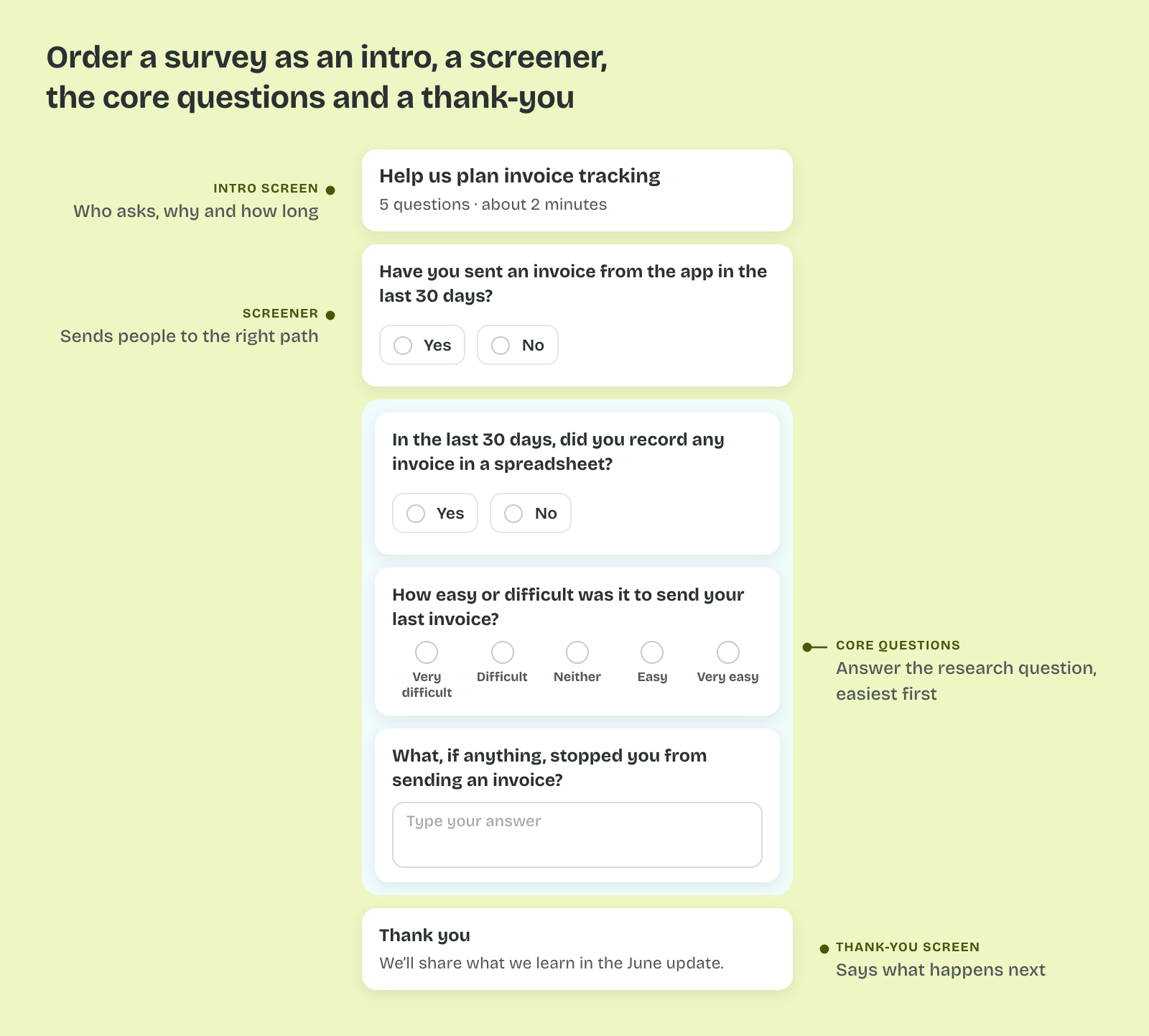
So a survey is built from named parts, each with its own job, in a fixed order.
The Invitation and the Intro
The invitation is the email or in-app message that asks people to take part. It names who is asking, why, and how long it takes, such as "Five questions, about two minutes." The intro screen repeats the time and says how the answers will be used.
That matters because people decide in the first few seconds whether to start. A stated length lets them judge the cost before they commit to it.
The Screener and the Core Questions
A screener is an early question that sends people to the right path or ends the survey for them. "Have you sent an invoice from the app in the last 30 days?" can route inactive accounts to a shorter set of questions.
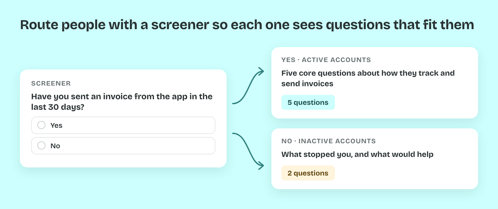
Then come the core questions, the ones that answer the research question. Put the easiest of them first and the most personal last. SurveyMonkey reports from its own data that surveys opening with a simple multiple-choice question are completed more often than those opening with a text box.
Then the survey ends on a thank-you screen that says what happens next. Questions about plan type or company size are often unnecessary at the end, because the product data already holds them.
The Question Types
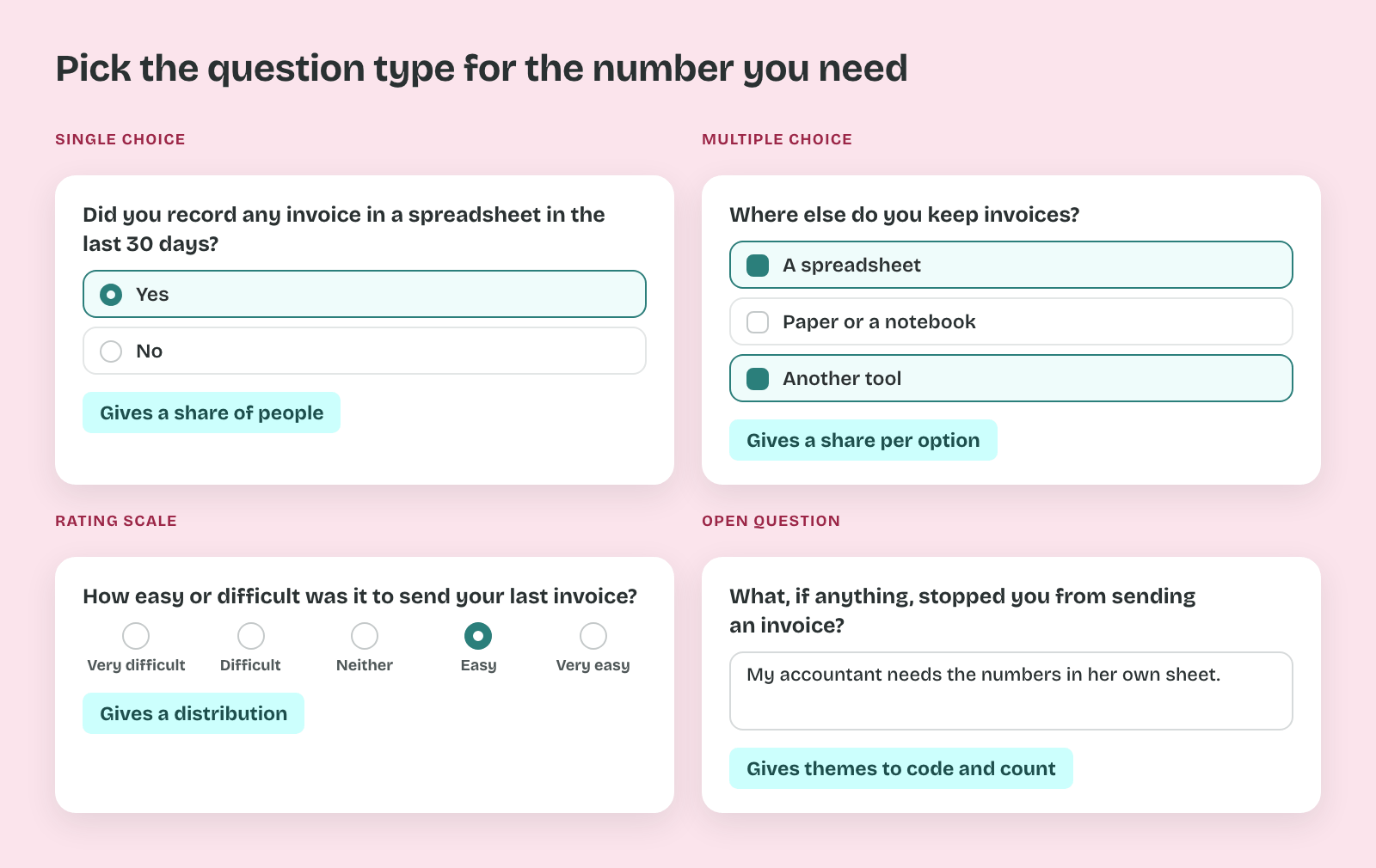
A single-choice question takes one answer from a list, and a multiple-choice question takes several. A rating scale asks for a position on a range, such as five points from "Very difficult" to "Very easy." An open question takes free text in the person's own words.
So each type gives a different kind of number. Choice questions give shares, rating scales give a distribution, and open answers give themes you code and count.
Standard Instruments
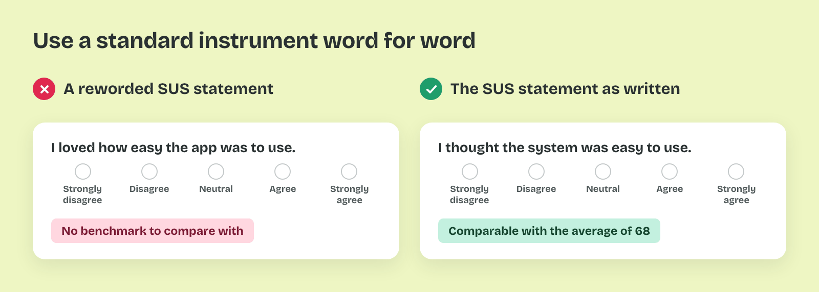
Some question sets have been tested across thousands of studies. The System Usability Scale (SUS) has ten fixed statements. Jeff Sauro reports an average SUS score of about 68 across around 500 products. The Net Promoter Score (NPS), from Fred Reichheld's 2003 article, asks one question about recommending the product on a scale from 0 to 10.
That's why a standard instrument is used word for word. A reworded SUS statement breaks the comparison with the benchmark, so the score of 68 no longer applies.
Pro tip: Take your own survey on a phone before sending it. Count the screens and time yourself, then put the real number in the invitation.