First Impressions and Visual Design
People judge a screen in a fraction of a second, and that judgment shapes everything they do next. Imagine a new home page where visitors can't say what the product does after looking at it, because a large photo pushes the headline below the fold.
Learn on the move: press play and turn your commute, walk or drive into time that grows your design career.

That's why first impressions get their own tests. They measure what people notice, feel and click before they read anything closely.
One Page and One Email
The lessons follow two designs from the invoicing app used by about 20,000 small businesses. The first is a redesigned home page with the headline "Invoices that get paid on time." The second is the email a client receives with an invoice to pay.
So each test has a clear moment to judge. A visitor decides in seconds whether the page is for them, and a client decides whether the email looks safe enough to pay from.
Five-Second Tests
A visitor tends to decide whether a page is for them before reading a full sentence. Gitte Lindgaard and colleagues found in 2006 that people rated a web page's visual appeal after 50 milliseconds much as they did after longer viewing.
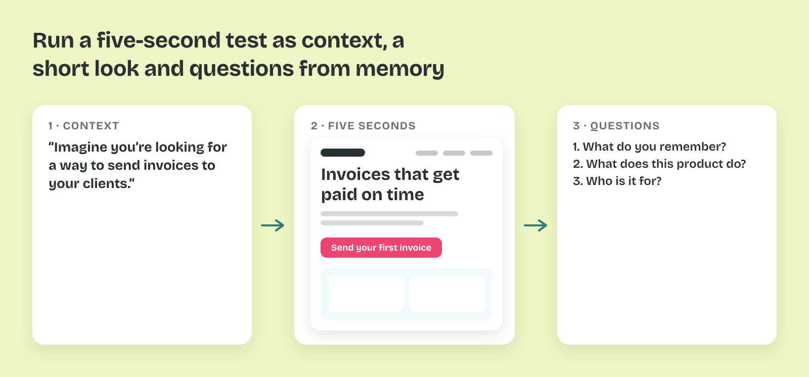
So a five-second test checks what a design communicates in that first look. People see a screen for five seconds, then answer questions from memory.
What It Answers
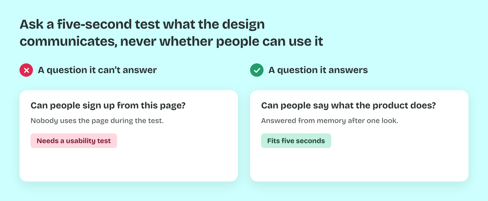
A five-second test answers questions about the main message and the visual hierarchy. "Can people say what the product does?" and "Do they notice the price?" are good questions for it. "Can they sign up?" is not, because nobody uses the page during the test.
That's why it suits landing pages, emails and single key screens. In the invoicing app, the question is whether visitors leave the home page knowing that it is about getting invoices paid.
Setting It Up
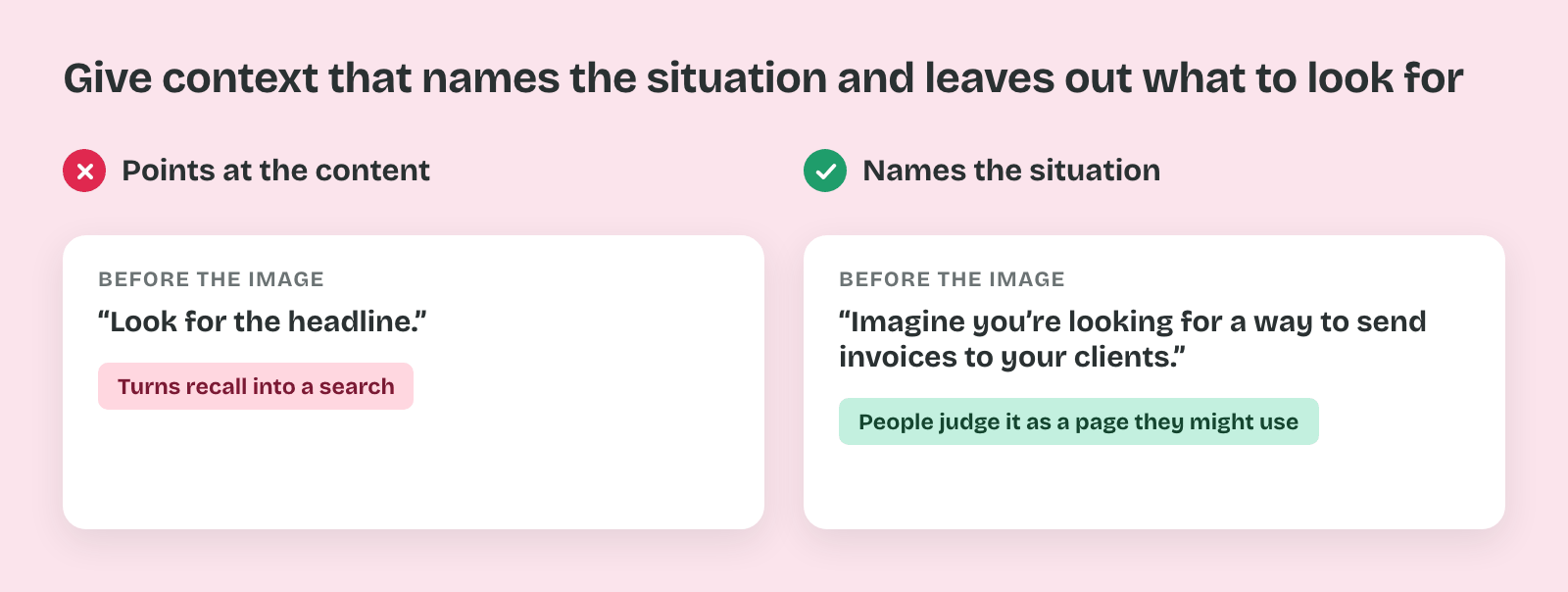
Show one static image at the size people would see it. Before the image, give one line of context, such as "Imagine you're looking for a way to send invoices to your clients." Without context, people judge the page as a picture instead of as a page they might use.
So the instructions name the situation and never the content. "Look for the headline" would turn the test into a search task and inflate the recall of that headline.
The Questions
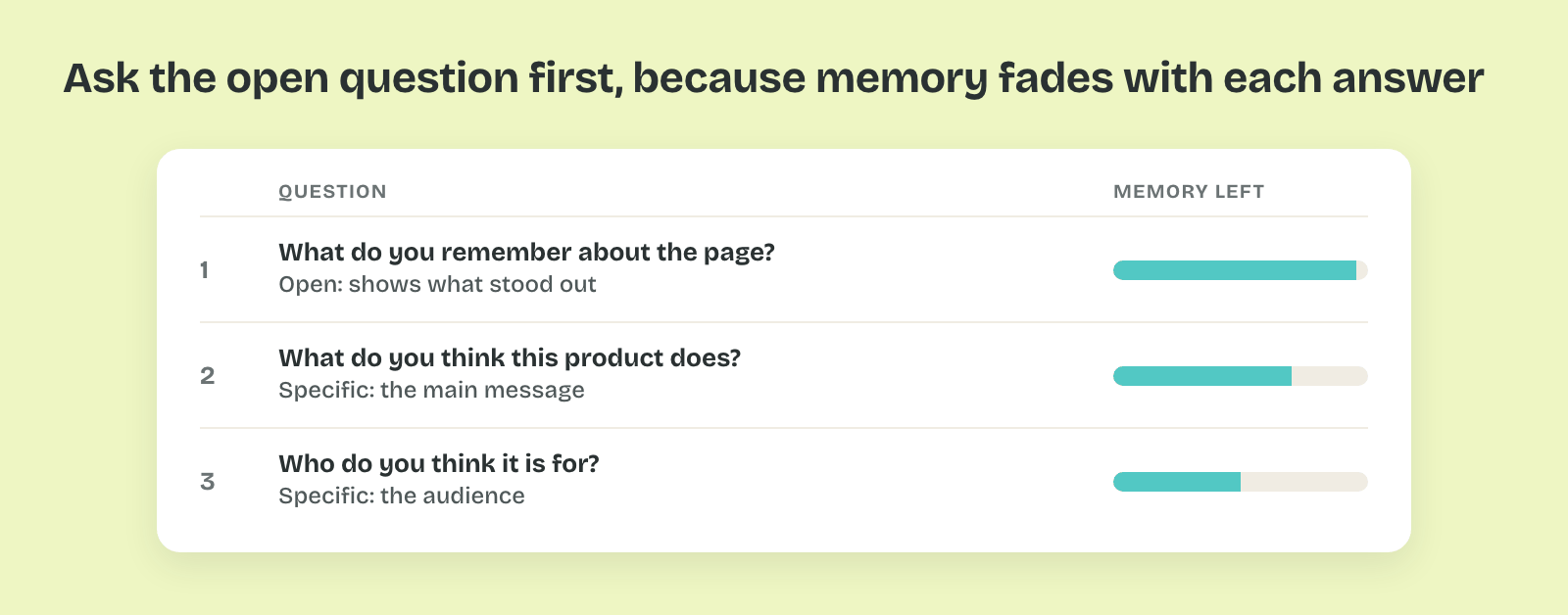
Start with an open question: "What do you remember about the page?" Then ask two to four specific ones, such as "What do you think this product does?" and "Who do you think it is for?"
That order matters because memory fades with each question. The first answer carries what stood out, and later questions show whether the details landed.
How Many Answers
Five-second tests run unmoderated, so dozens of answers are cheap. With 40 answers, a share near 50% carries a margin of about ±15 points. In the invoicing test, 11 of 40 people (28%) recalled invoicing on the photo-led version. On the headline-led version, 29 of 40 (73%) did.
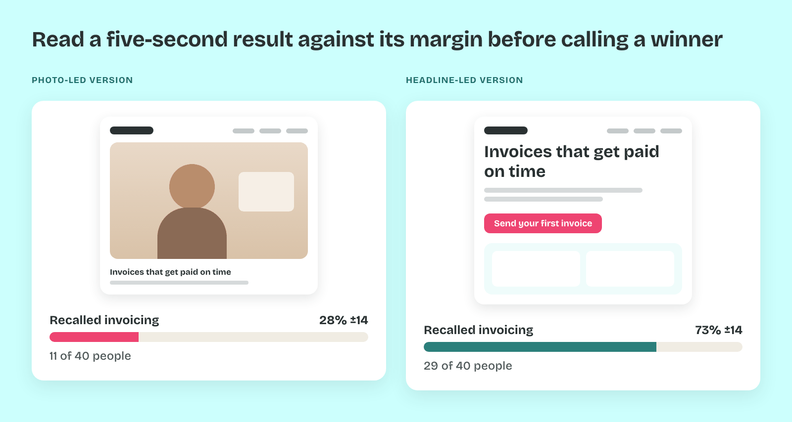
Thus a difference that large holds up even with the margin. A gap of five points between two versions would need hundreds of answers to mean anything.
Pro tip: Run the same five-second test on a competitor's page too. When yours is recalled less clearly than theirs, the gap tells the team more than your number alone.