What Makes a Good Typeface
Not all typefaces are equally well made. The free font that looks almost right usually has something structurally wrong with it - visible in the spacing, the drawing, the details. The problem is that these flaws tend to surface as a vague wrongness rather than a specific diagnosis.
Train your eye for type with your ears: listen now, then notice every sign on the way home.

Spacing
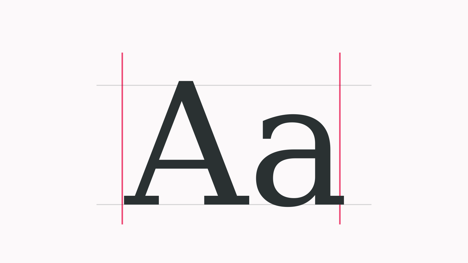
Spacing is the most reliable indicator of type quality and the first thing to check. Set a block of body text at normal size and look at the rhythm. Does the space between letters feel consistent, with white areas distributed evenly throughout the word? Or are some pairs tight while others gape?
Good spacing is built into the typeface's sidebearings (the space on either side of each glyph) and refined through a kerning table that corrects specific problem pairs. A well-made typeface has sidebearings set so carefully that most pairs need no kerning at all. A poorly made typeface has visible rhythm gaps, particularly around diagonal letters: V, W, A, T, Y.
The quick test: set “AVATAR” and “Waffle” and look at the spacing between each pair. Obvious gaps or collisions without any tracking applied are a red flag.