Psychology in UX
Imagine a sign-up page written for a careful reader, used by people who scan it in a few seconds. They skip the paragraph that explains the plans, miss the link in the banner, and pick whatever is already selected. Then the team wonders why so many people chose the wrong plan.
Learn on the move: press play and turn your commute, walk or drive into time that grows your design career.

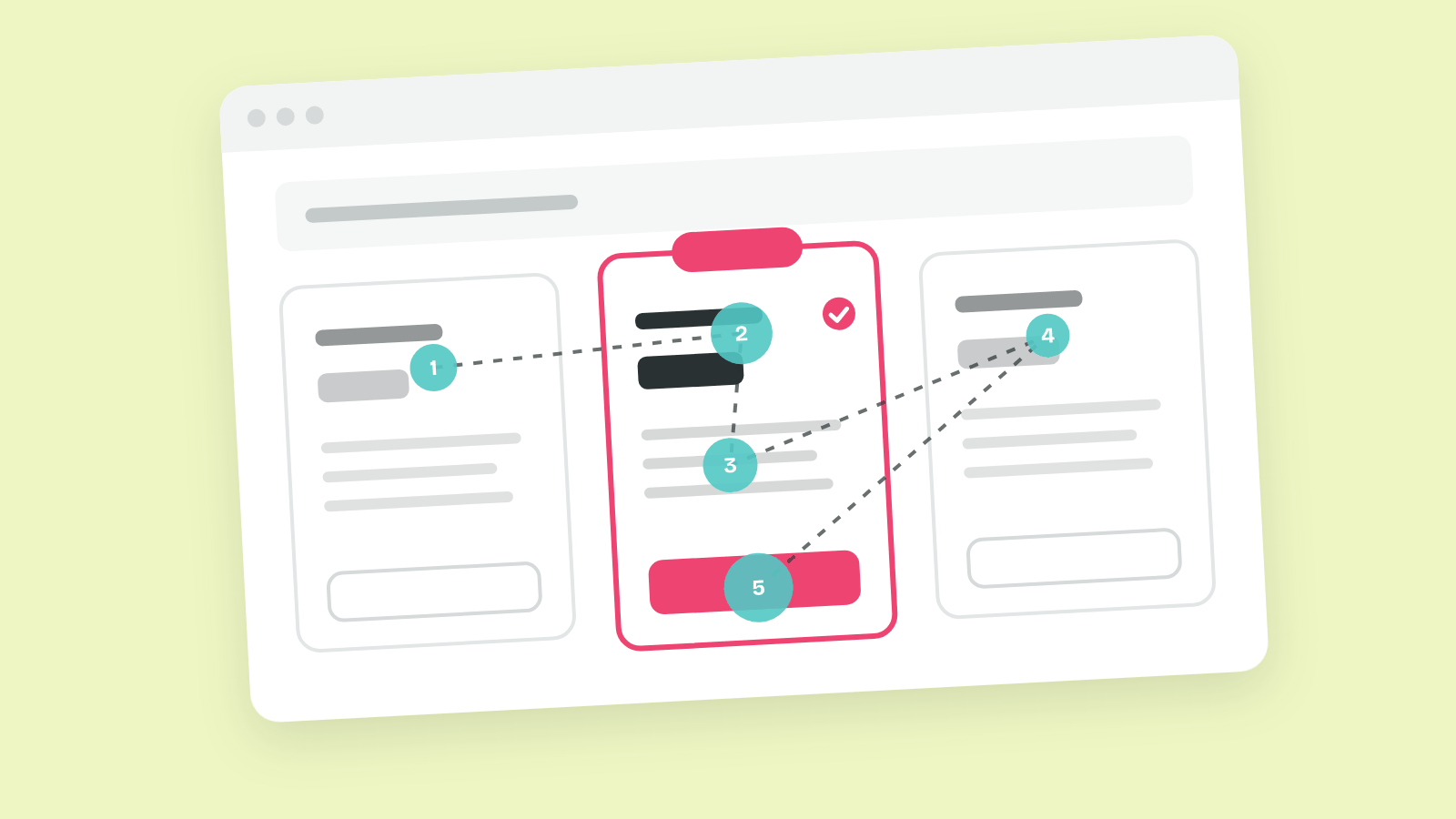
That gap is what psychology in UX closes. A spec assumes people read, remember and weigh every option. Real people notice a little, hold a little in mind and take shortcuts, so a design that fits those habits works better than one that fights them.
Why Minds Take Shortcuts
People take shortcuts because attention and memory are scarce. Daniel Kahneman described two modes of thinking in Thinking, Fast and Slow (2011): a fast, automatic one and a slow, effortful one. Most screens are handled by the fast mode, which is why a design has to make sense at a glance.
That knowledge carries a responsibility too. The same shortcuts that help people finish a task can push them into choices they didn't want, and Ethical UX & Dark Patterns covers where that line sits.
How People Process a Screen
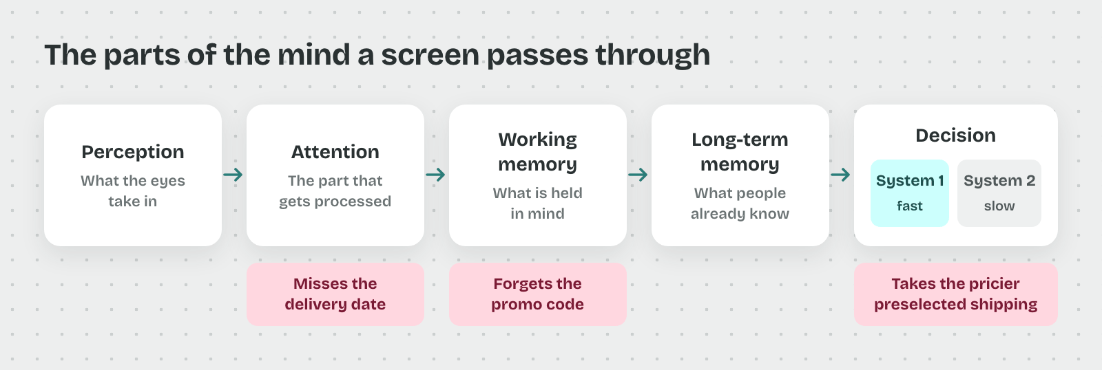
Imagine a checkout where people miss the delivery date, forget the promo code they typed a minute ago, and accept a pricier shipping option without noticing. Each of those mistakes happens in a different part of the mind.
So a designer needs the parts named before fixing anything. A screen passes through perception, attention, working memory and long-term memory, and then a decision gets made by one of two systems of thinking.
Perception and Attention
Perception is everything the eyes take in, and attention is the small part of it a person actually processes. People can't attend to a whole screen at once, so they pick what looks relevant to their goal and ignore the rest.
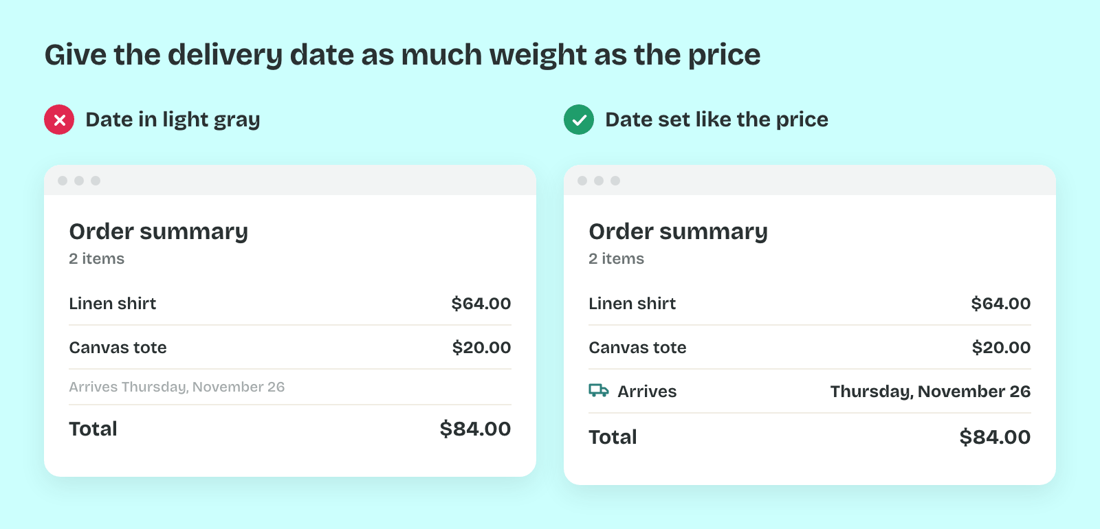
That's why the delivery date gets missed. It sat in light gray text beside a bold price, and the price won the person's attention. What people notice is covered in Attention and Perception.
Working Memory
Working memory is what people hold in mind while they use a screen. Nelson Cowan's review in 2001 put its limit at about four chunks of information at a time. Anything beyond that drops out unless the screen keeps showing it.
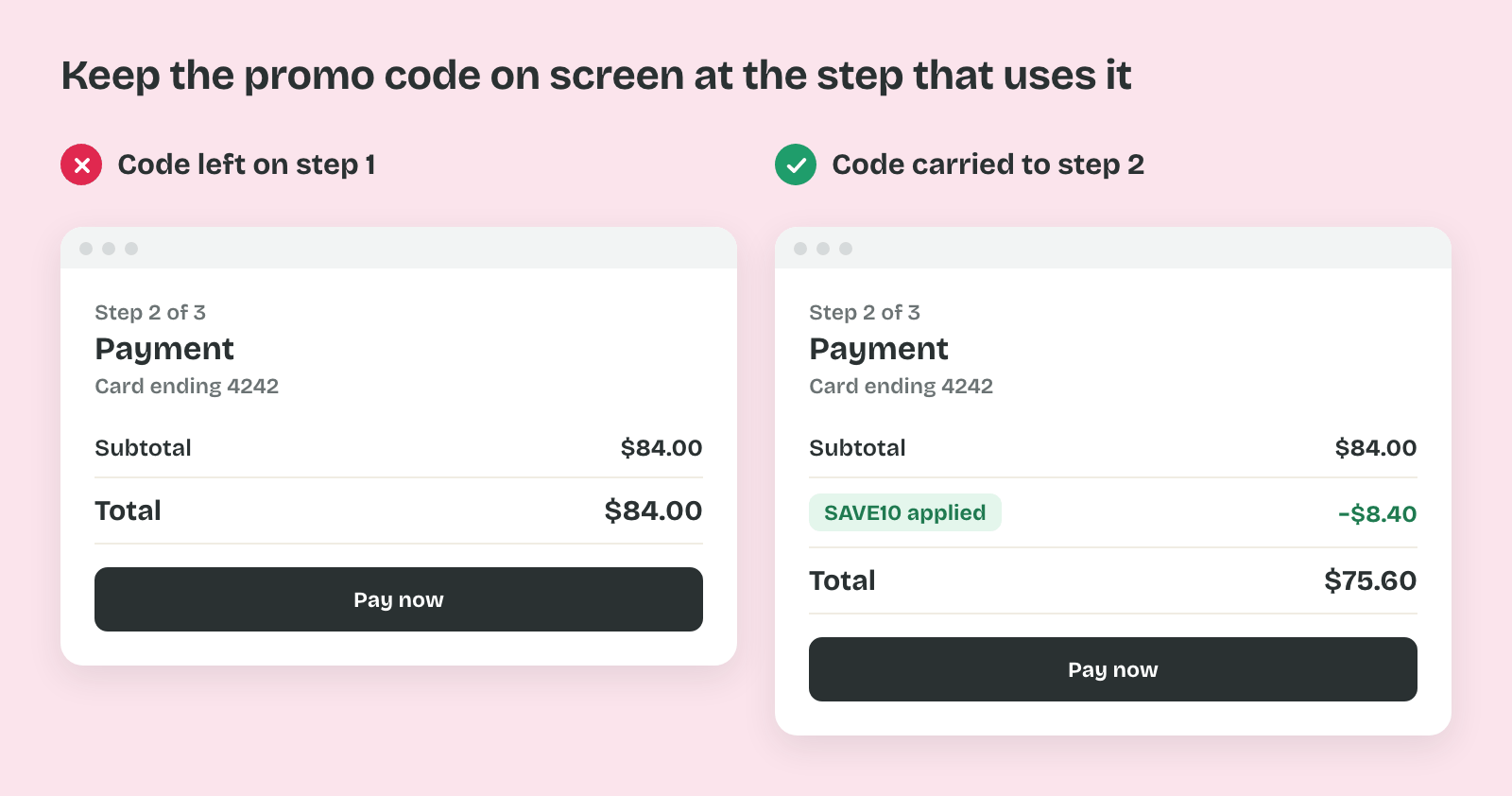
In practice that explains the forgotten promo code. It was typed on one step and needed on the next, with no reminder on screen. What people can hold, and how to lower the load, is covered in Memory and Cognitive Load.
Long-Term Memory
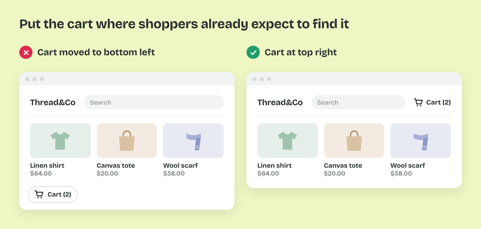
Long-term memory holds what people already know: other products, conventions and their own past choices. People use it to predict what a screen will do before they act. A cart icon in the top right works because years of shopping put it there.
That stored knowledge is also why familiar patterns feel easy. People rely on it to save effort, and a screen that breaks a convention makes them think again. Moving the cart to the bottom left would cost every returning shopper a moment of searching.
System 1 and System 2
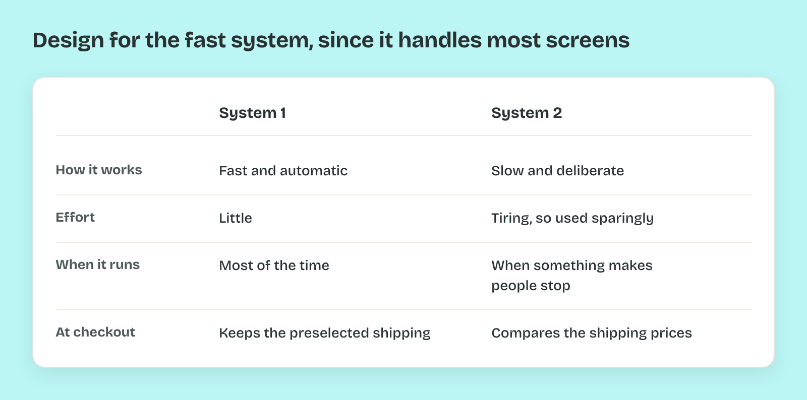
The decision itself is made in one of two modes. Daniel Kahneman calls the fast, automatic mode System 1 and the slow, deliberate one System 2. System 2 is slow and tiring, so people use it only when they must. System 1 picks the preselected shipping option, and System 2 compares the prices only when something makes it stop.
Thus most screens are used by System 1, and good design works with that. Decision Making and Choice covers the shortcuts System 1 takes, and Social Influence covers the ones it borrows from other people.
Pro tip: When a task goes wrong in testing, ask which part broke down: did people miss it, forget it, misread it from habit, or choose too fast? Each answer points to a different fix.