
UX Fundamentals
Show a new checkout flow to five colleagues and you'll often collect five different comments. One says it feels busy. Another dislikes the shade of the button. A third gets stuck on the address step and blames themselves. By the end of the hour you have a page of notes and no way to tell which one matters.
Learn on the move: press play and turn your commute, walk or drive into time that grows your design career.

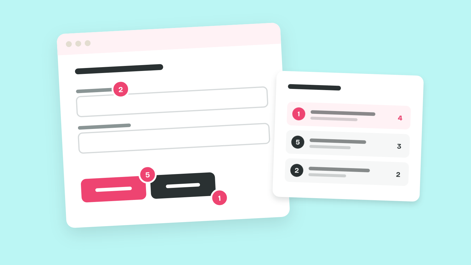
That page is hard to act on for two reasons. Nobody named what each problem breaks, so the team ends up arguing about taste. And nobody said how bad each problem is, so the button shade sits on the same list as the step where people give up.
Nielsen's ten usability heuristics close the first gap, and a severity rating closes the second. Together they turn a flow review into a ranked list a team can plan from.
Why This Is the First Method to Learn
A heuristic evaluation needs no participants, no lab and no recruiting budget. So it fits into the first week of a project, or into an afternoon before a design review. Jakob Nielsen and Rolf Molich introduced the method in 1990. In one case study Nielsen later published, the benefits came to about 48 times the cost.
That speed comes with a limit. Averaged over six of Nielsen's projects, a single evaluator found only about 35% of the usability problems. That's why the method asks for three to five people working alone, and why their findings still need rating before anybody fixes them.
The 10 Usability Heuristics
Most interface problems you meet in a review have been seen many times before. A form goes silent after you press Pay. A label uses a word from the database. A delete button sits right next to Save. The product and the screen change, and the cause underneath stays the same.
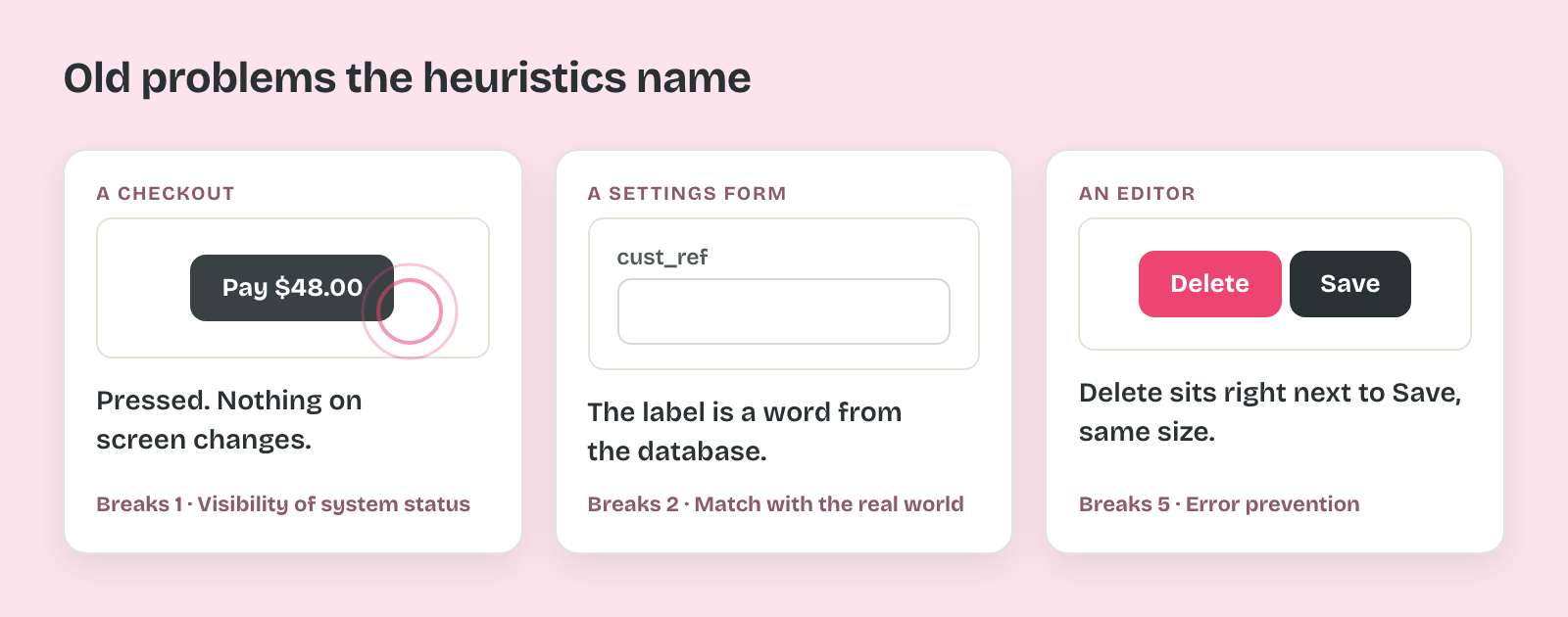
That repetition is what Nielsen's heuristics capture. Each one names a recurring cause, so you can say which rule a screen breaks instead of saying that it feels off.
Where the Ten Came From
A heuristic is a rule of thumb that helps you find something faster than working it out from scratch. The word comes from the Greek heuriskein, "to find", the same root as eureka. That root fits the method well, because the heuristics help you find problems in a design that already exists.
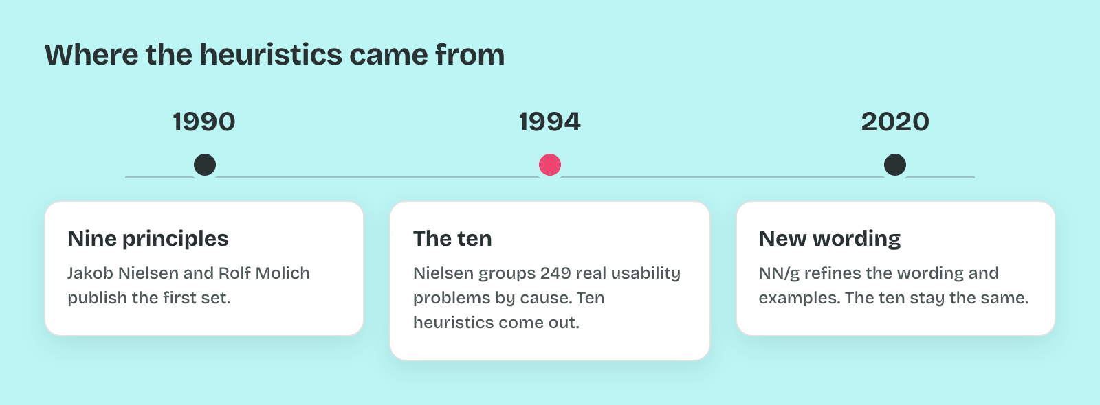
Jakob Nielsen and Rolf Molich published the first set in 1990, and it had nine principles. In 1994 Nielsen ran a factor analysis on 249 usability problems from real projects and grouped them by cause. The ten heuristics in use today came out of that analysis. Nielsen Norman Group refined the wording and added examples in 2020, and the ten themselves have stayed the same since 1994.
What People See and Understand
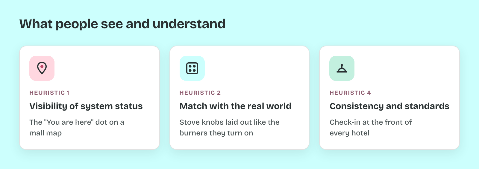
The first group asks whether people can read what the interface is telling them. Each heuristic below carries the real-world comparison NN/g gives for it.
- 1. Visibility of system status: the interface tells people what is happening, quickly. It works like the "You are here" dot on a mall map.
- 2. Match between the system and the real world: the interface uses the words and order people already know. Stove controls laid out like the burners they turn on are the physical version.
- 4. Consistency and standards: one thing has one name and one behavior, and it follows the platform's conventions. Hotels put check-in at the front for the same reason.
When Things Go Wrong
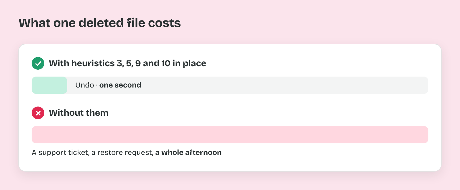
The second group covers mistakes, exits and getting unstuck. Together these four decide whether a mistake costs a second or a whole afternoon.
- 3. User control and freedom: people can leave, cancel or undo without penalty. In a building, that's the clearly marked emergency exit.
- 5. Error prevention: the design stops the mistake before it happens. Guard rails on a mountain road do the same job.
- 9. Help users recognize, diagnose and recover from errors: an error message says what went wrong and how to fix it, in plain words. A wrong-way road sign is the model.
- 10. Help and documentation: help is easy to search, focused on the task, and there when it's needed. An information kiosk at an airport is the comparison.
How Much People Have to Carry
The third group is about memory and effort. A screen can be readable and forgiving and still be slow, because it asks people to remember too much or wade through too much.
- 6. Recognition rather than recall: options stay visible, so nobody has to remember them. Picking a country's capital from a list is easier than naming it cold.
- 7. Flexibility and efficiency of use: experts get shortcuts that beginners never have to see. Locals take side streets while visitors follow the main road.
- 8. Aesthetic and minimalist design: every element on screen earns its place, because each extra one competes with the ones that matter. An ornate teapot with a handle too fancy to hold is the warning.
So learn the numbers along with the names. Most evaluation reports write "H6" or "breaks #6", and that number is how findings get sorted and counted later.
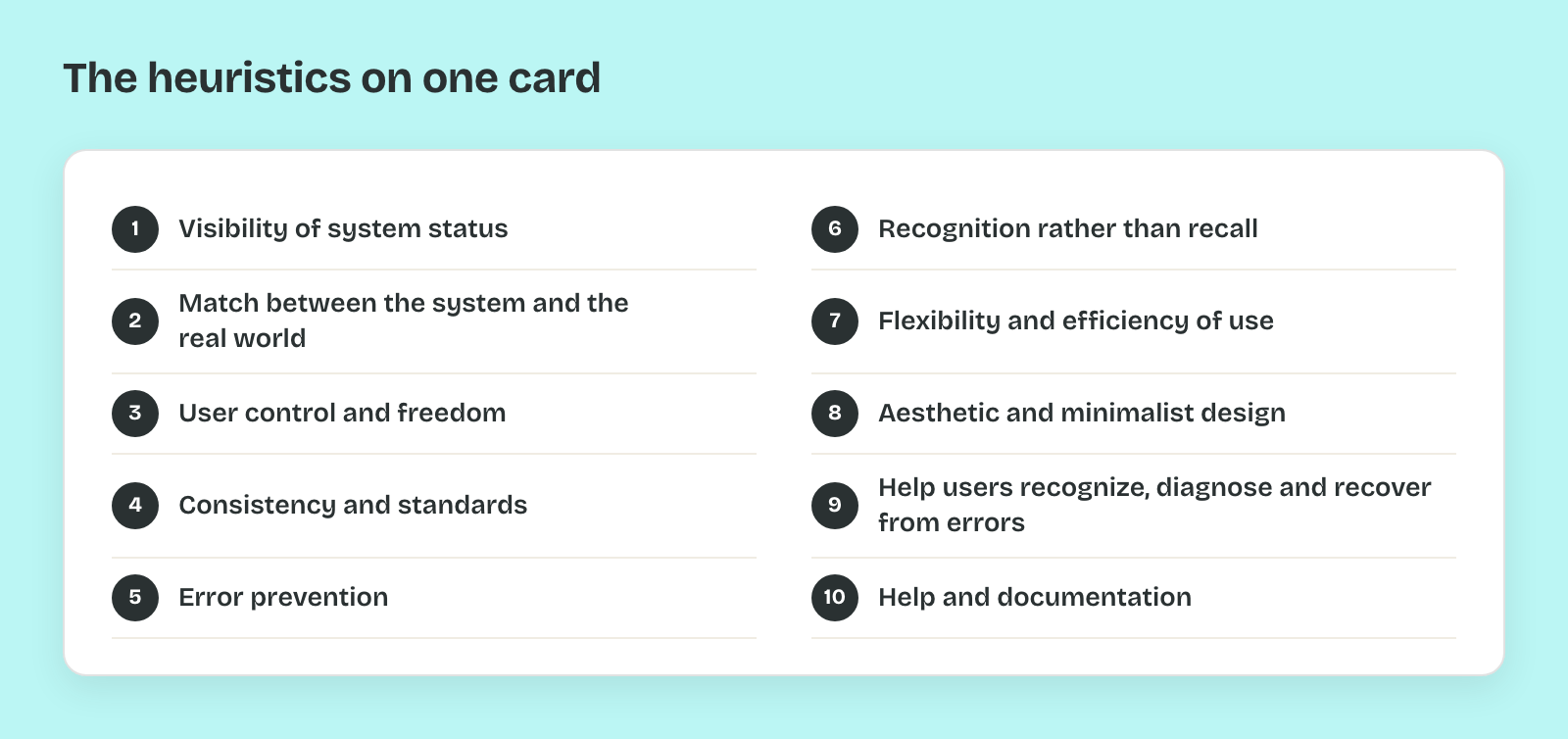
Pro tip: Keep the ten names on one card beside your screen during every evaluation. Heuristics overlap, so when a problem seems to break two, log it under the one closest to its cause. A silent Pay button breaks status first and error prevention second.