
The Door That Taught Me About Design
You know the door that clearly says PUSH, so you pull it, then glance around hoping nobody saw. There's a whole way of thinking hidden in that little moment.
Spot the next Norman door before you push it: listen on your walk and see every door differently.

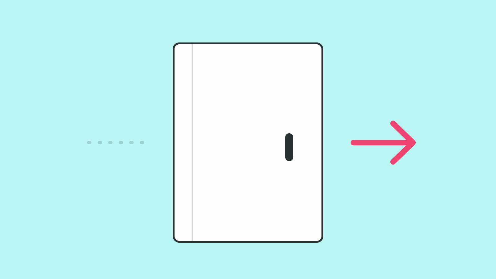
It comes from Don Norman, who wrote a book to say something simple. When a person struggles with a thing, it usually isn't that they're clueless. The design just didn't make itself clear.
The Design Carries the Effort
That one idea changed how I look at every confusing screen. My first question now is what the design got wrong, before I wonder about the person using it. It's a kinder question, and it's usually the more useful one.
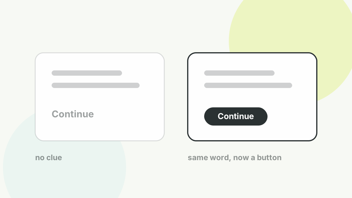
The user isn't slow. The clue was missing.
Look for the Missing Clue
Most “confusing” screens are not missing features. They're missing a clue. The button worked. It just forgot to look like a button. Once you start hunting for the missing clue, a lot of design gets simpler, and a lot kinder.
So the next time you reach for the phrase “user error”, pause. It's a comfortable label, and the moment you write it down you stop looking for the real cause. The door was the problem. It usually is.