B2C UX
Somebody taps an ad on a bus, lands on your product, and gives it about as much attention as they gave the ad. Nobody trained them, no procurement process committed them, and no manual will ever be read.
Learn on the move: press play and turn your commute, walk or drive into time that grows your design career.
Listen to the full B2C UX course on DesignPath

They will leave the moment it asks for more than it has given. A competitor is one tap away and switching costs nothing, so every step you add is a place to lose them. That is the defining condition here: you earn everything, immediately, from somebody who did not plan to be there.
It changes what the general rules are worth. You cannot count on a motivated user, so friction does not slow people down, it filters them out. You cannot design for a typical user either. A product used by millions meets a teenager on a cracked budget phone and a retiree on an iPad, hitting the same screen with nothing in common.
Anatomy of a First Session
A consumer product's first session has six stages, and a person can leave at four of them without any cost to themselves.
The stages are the same whether the product is a game, a bank or a recipe app. What differs is which one each product happens to be bad at, and most teams have never separated them.
The Six Stages
- The entry. A search result, an ad, a store listing, a link from a friend. This is where the expectation is set, and a mismatch here poisons everything after it.
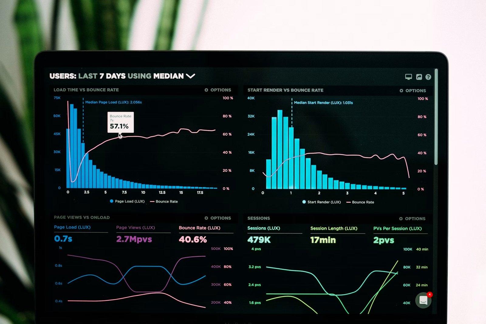
- The load. Nothing else can happen until this finishes. Amazon found in a 2006 experiment, reported by the engineer Greg Linden, that every additional 100 milliseconds of page load cost about 1% in sales. Google reported around the same time that half a second of extra delay dropped search traffic by roughly 20%.
- Orientation. The first screen, where somebody works out what this is and whether it is for them. Seconds, not minutes.
- The value moment. The first time the product does something worth having: the song plays, the transfer is scheduled, the photo is edited. Everything before this is cost paid by the user.
- The commitment. The account, the permission, the payment. Whatever is asked for here is charged against the value already delivered.
- The return trigger. The reason to open it again: a notification, a saved item, an unfinished thing. Without this the session was a demo.
Where the Drop Happens
Four of those stages are exits, and each has a different cause.
The entry loses people to a mismatch between the promise and the screen. The load loses them to time. The commitment loses them when it arrives before stage four. And the absence of a return trigger loses them silently, a day later, where no funnel chart shows it.
Orientation and the value moment are the two stages that keep people, which is why the design work belongs there and the measurement belongs everywhere else.
The One Rule About the Order
Stage five must come after stage four.
An account wall between orientation and the value moment asks somebody to pay before they have received anything, and at consumer scale the answer is usually no. Moving it one stage later is the single highest-value change available in most consumer products, and it costs nothing but sequencing.
Onboarding & Activation owns the ladder of value in detail. What this domain adds is the scale: at a million sessions, a 2% shift between stages is twenty thousand people.
Measure the Stages Separately
A single conversion number hides which of the six is broken.
Instrument each transition and look at them as a row. A product losing 40% at the load has a performance problem. One losing 40% at the commitment has a sequencing problem, and no amount of work on the second fixes the first.
Pro tip: Open your own product from a cold device on a slow connection and time each of the six stages with a stopwatch. The stage where you get bored is the one your users are leaving at.