Palettes That Work: Harmonies, Mood & Structure
You've found a blue you love. It looks great in the color picker. You drop it into the design - and something's off. It fights the background, flattens the hierarchy, or clashes with the green you chose last week. The blue didn't change. The context did.
Learn on the move: press play and turn your commute, walk or drive into time that grows your design career.
Listen to the full Palettes That Work: Harmonies, Mood & Structure course on DesignPath

This is the central problem of working with color: no color exists in isolation. Josef Albers spent decades proving this - the same square of gray looks lighter on a dark background and darker on a light one. What you see is always a relationship, never a color on its own.
Working with Color
Working with color means choosing colors in relation to each other - and then organizing them so they do specific jobs in a design.
Done well, it's invisible. The eye moves where you intended. The hierarchy is clear. The mood is consistent. The user doesn't consciously register the color decisions because they're all pointing in the same direction.
Done badly, it's felt as something not quite right - a palette that feels chaotic, a layout where nothing stands out, a design that somehow looks amateur even when each individual color seems fine. Usually the problem isn't a bad color. It's colors that weren't chosen in relation to each other.
Working with color means understanding two things: how colors relate (the wheel, harmonies, contrast), and how to organize them into a palette that holds together and scales.
The Color Wheel
In 1704, Isaac Newton took the spectrum of visible light - the familiar rainbow of red through violet - bent it into a circle, and produced the first color wheel. His insight was that the colors at each end of the spectrum (red and violet) are actually close to each other in perception, so closing the circle made sense. Every color wheel since has built on that observation.
The wheel is useful, but it gets oversold. It shows hue relationships. It doesn't show value, saturation, or how colors interact in context. Two colors can sit in a theoretically harmonious position on the wheel and still clash terribly in a design - because the wheel knows nothing about how bright or muted they are, or what's around them.
How the Wheel Is Organized
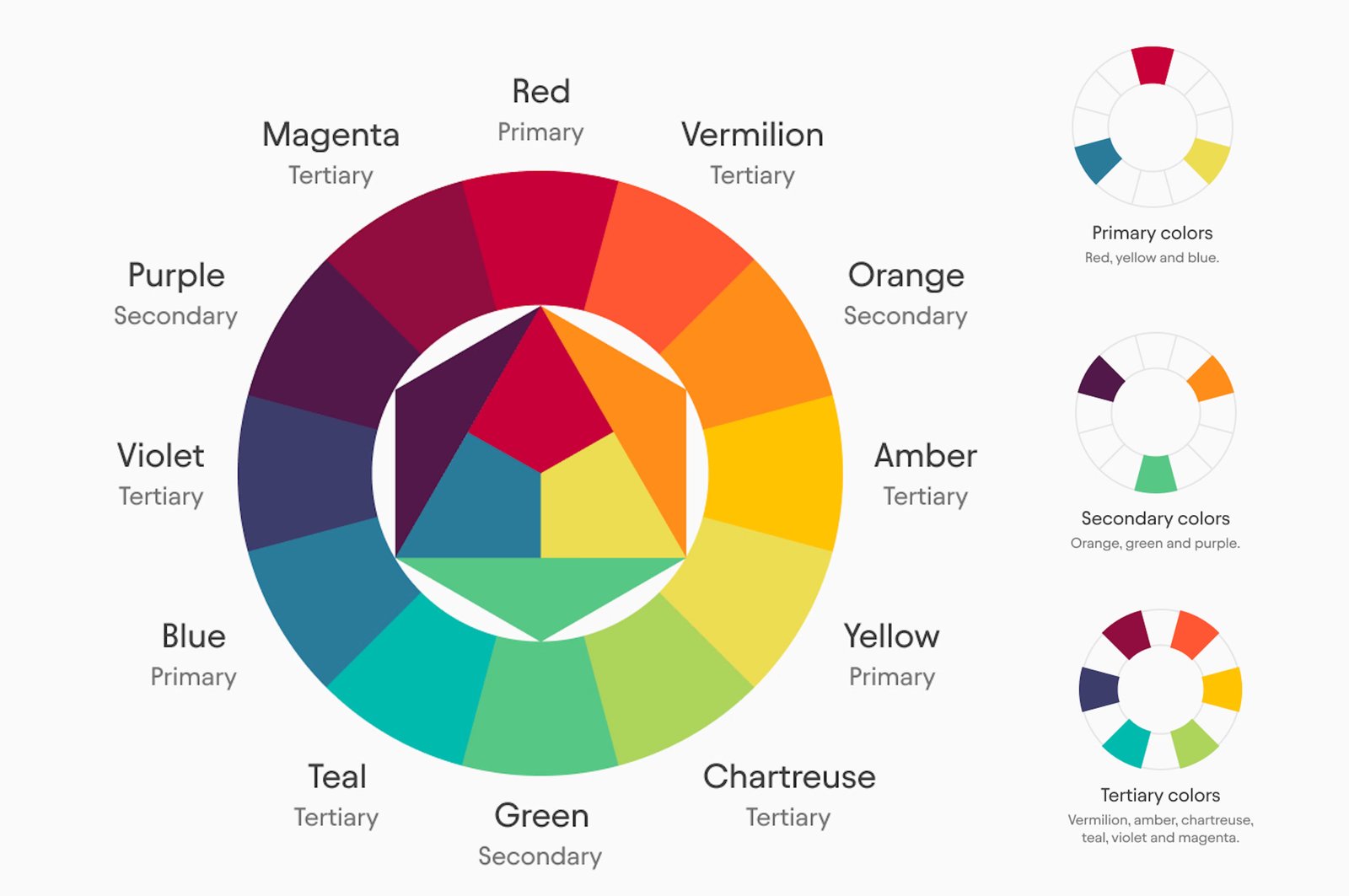
The standard color wheel organizes hues in the order they appear in the visible spectrum, looped into a circle. Moving around the wheel, you pass through red, orange, yellow, green, blue, and violet - then back to red.
The wheel uses three categories of color based on how they're mixed:
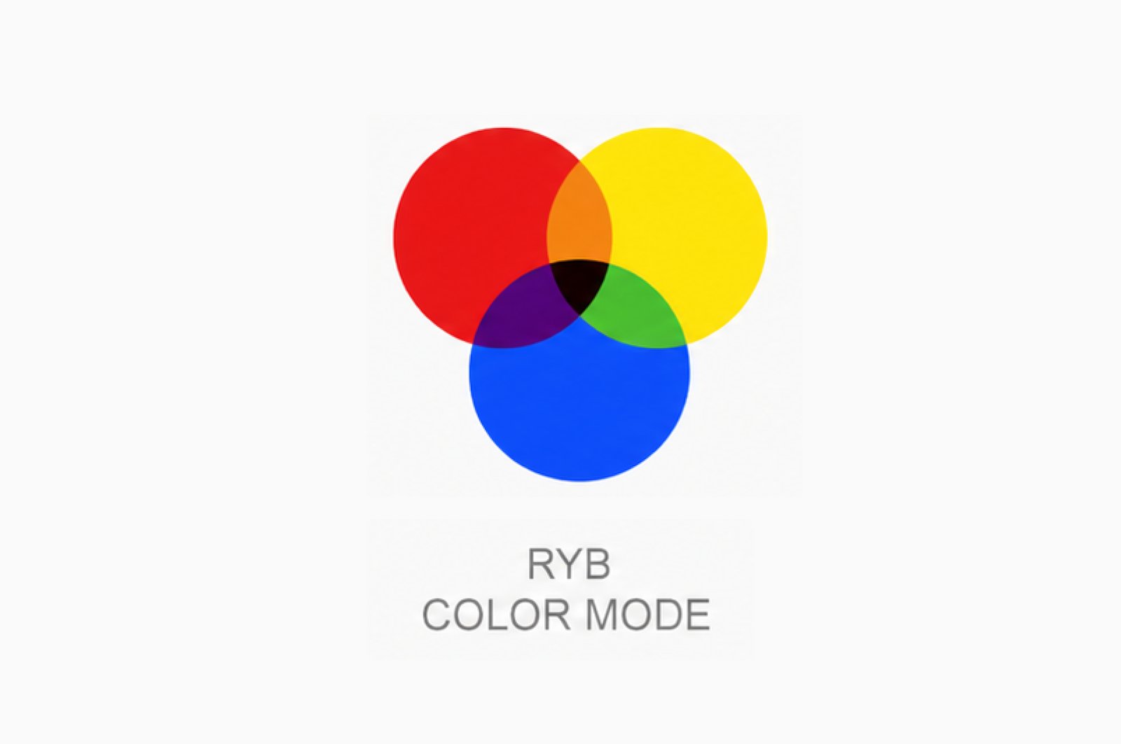
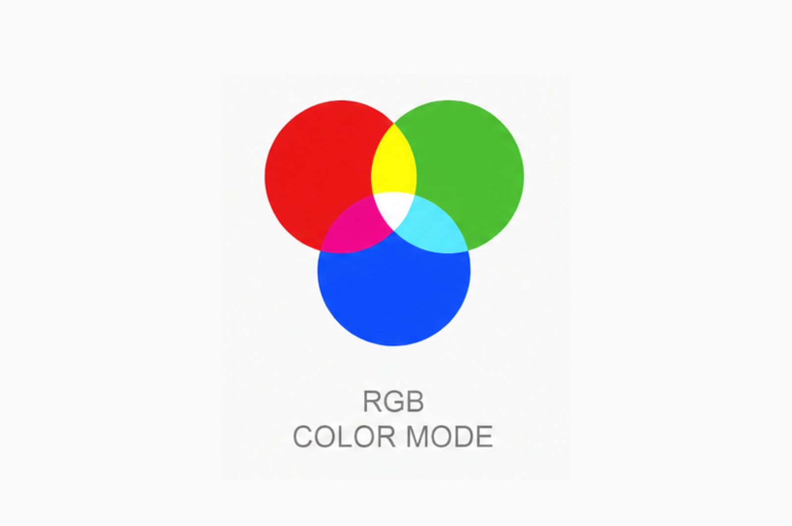
Primary colors are the starting points - they can't be created by mixing other colors. In the traditional RYB (red, yellow, blue) model used in painting, these are red, yellow, and blue. In the RGB model used by screens, they're red, green, and blue.
The primaries differ between models, which is why the wheel you learned in school looks different from the one in Figma's color picker.
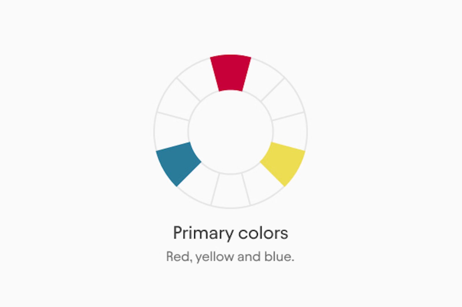
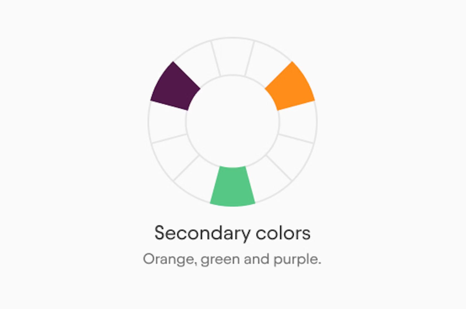
Secondary colors are created by mixing two primaries together. In RYB: orange (red + yellow), green (yellow + blue), violet (blue + red). In RGB: cyan (green + blue), magenta (red + blue), yellow (red + green).
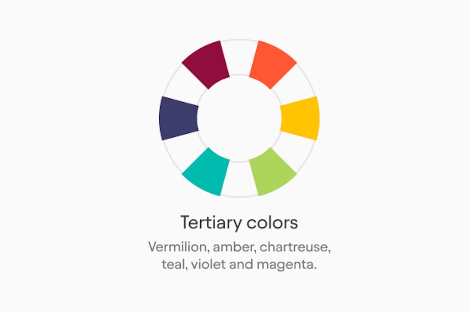
Tertiary colors sit between a primary and a secondary - red-orange, yellow-orange, yellow-green, and so on. A standard 12-color wheel includes all three groups.
The Four Models
There are actually four different color wheels in common use, and they organize color differently because they're built on different models.
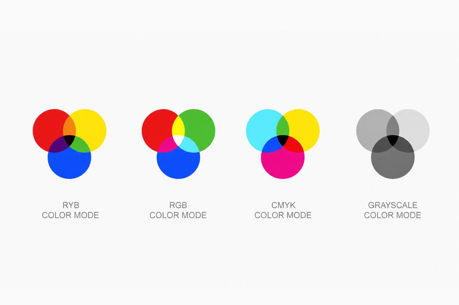
The RYB wheel - the one from art class - is based on pigment mixing. It's the wheel most harmony systems (complementary, analogous, triadic) were developed from. It's useful for understanding traditional color theory and for print work.
The RGB wheel - the one digital tools use - is based on light. The primary colors are red, green, and blue; the secondaries are cyan, magenta, and yellow. If you've ever noticed that Figma's opposite of red is cyan rather than green, that's why.
For digital design, the RGB wheel is the accurate model. But most harmony rules were built on RYB - so in practice, designers use both, depending on whether they're applying classical theory or working directly in a design tool.
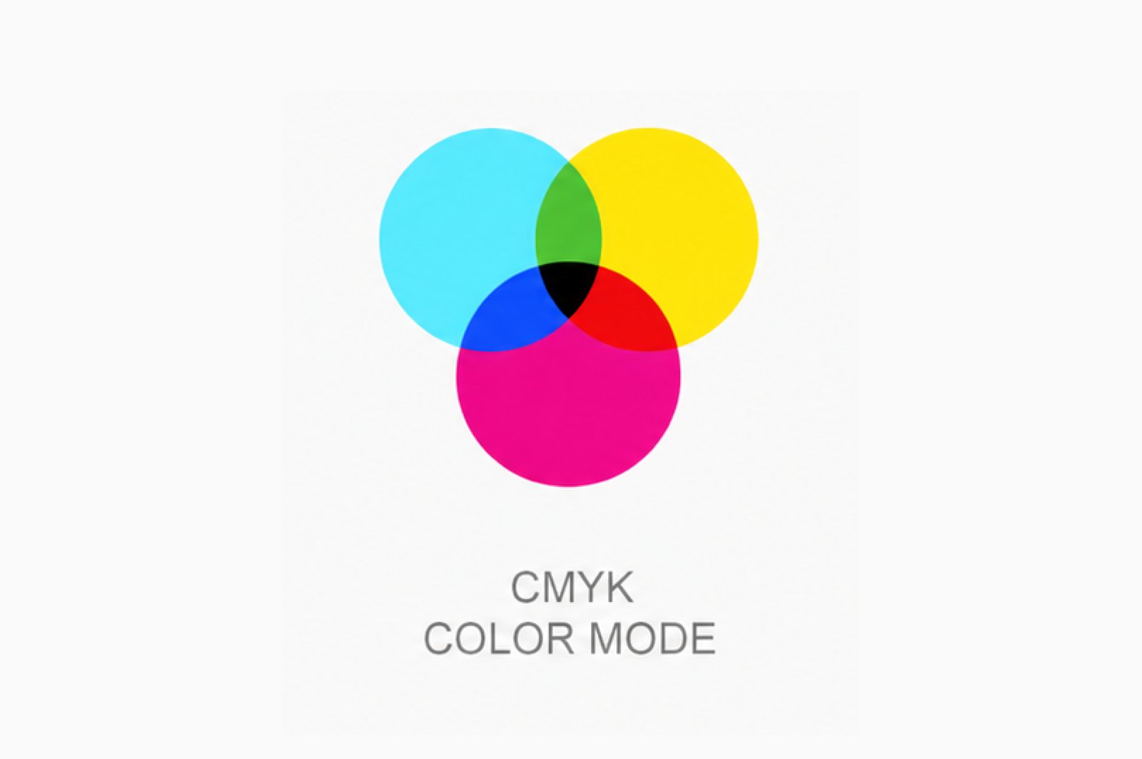
The CMYK wheel - the one print uses - is built on ink instead of light, and it runs the RGB logic in reverse. Its primaries are cyan, magenta, and yellow, with black added as the "K" because mixing real inks never quite gets you a clean one. It is also subtractive. A screen starts from black and adds light to reach white, while ink starts from white paper and subtracts light as you layer color on top. That reversal is why a design that glows on screen can come back flat and muddy from the printer - the RGB wheel can describe vivid colors with no clean recipe in CMYK ink.
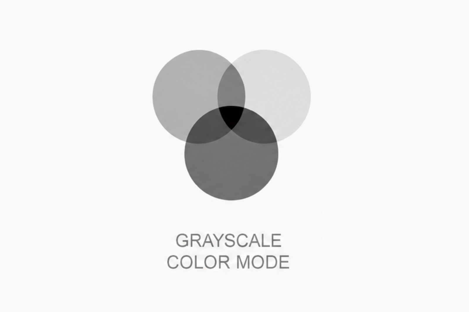
And then there's no wheel at all. Strip the hue out and you are left with grayscale, pure value, a straight line from white through every gray to black, with nothing to bend into a circle. It belongs in this conversation precisely because it's everything the wheel leaves out. Desaturate any palette to grayscale and you see its value structure with no color to distract you: which elements really contrast, and which only looked distinct because their hues differed. It's the fastest way to catch a pairing the wheel called harmonious that actually collapses into mush once the color is gone.