
Mobile Design
You design a layout on a 27-inch monitor with a pixel-precise cursor and hover states to spare. Then a real person opens it one-handed on a bus, and half your tap targets are unreachable while the other half fire the wrong thing. That gap — between how you build and how people actually hold a phone — is what mobile design is really about. The physical reality of a thumb on a small screen quietly rewrites your desktop assumptions before the user consciously notices anything is wrong.
Learn on the move: press play and turn your commute, walk or drive into time that grows your design career.
Listen to the full Mobile Design course on DesignPath
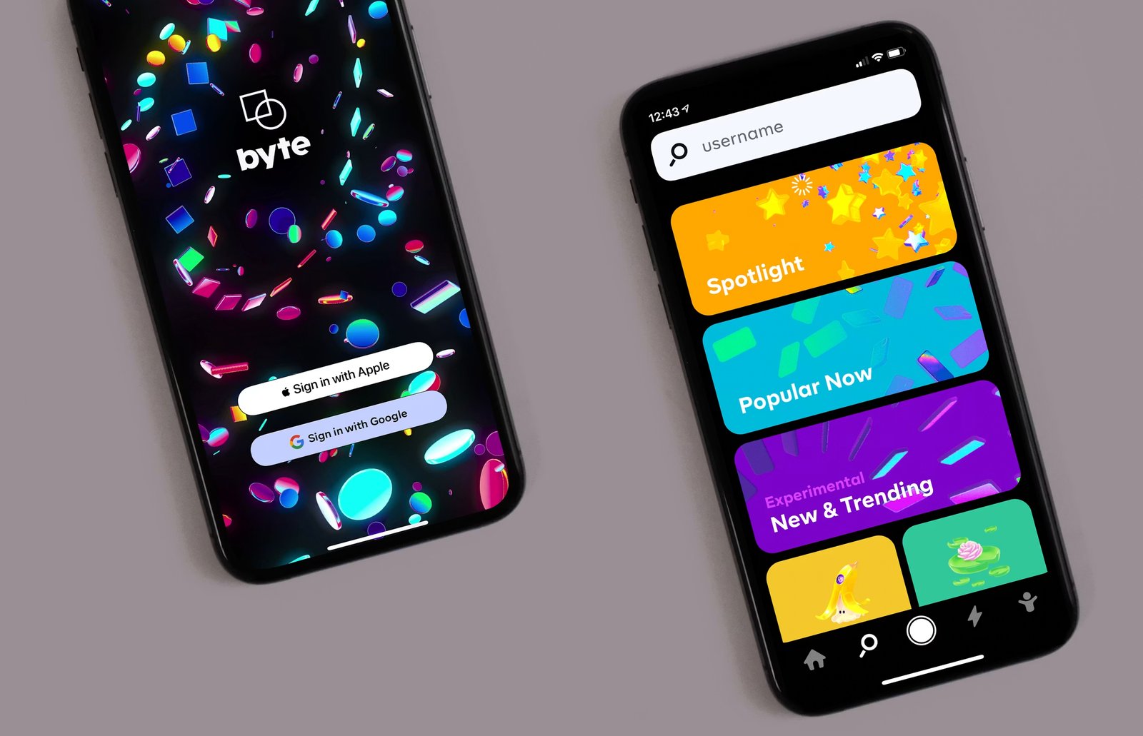
Get it right and mobile design is invisible: navigation that's just there, targets the thumb hits, gestures that don't lock anyone out, an app that feels native to the platform it's on. Get it wrong and every one of those becomes the product's most visible failure. This module is the set of constraints — reach, touch, platform — that separate a mobile design that works from a desktop design squeezed onto a phone.
When It Matters Most
- You're adapting a desktop design — that's where the broken assumptions (hover, precise targets, top-placed nav) hide.
- One-handed use is common — which, for ~half of users, it is.
- You're shipping to both iOS and Android from one design — and it feels "off" on one of them.
- Navigation isn't landing — users can't find things, or can't reach them.
What This Module Covers
We start with the four navigation principles, then the physical layer: touch targets and thumb zones, and gestures, hover, and scroll on a screen with no cursor. From there the navigation specifics — bottom navigation rules and navigation patterns (tab bar, FAB, hamburger) — and finally iOS vs Android conventions, where one Figma file isn't enough. The next articles show you how.
The Four Navigation Principles
Good mobile navigation is invisible. Users don't notice it — they just find what they're looking for. The moment navigation fails, it becomes the product's most visible problem: the thing people complain about, the reason they can't do the thing they came to do. Four fundamentals keep it invisible, and they're non-negotiable.
1. Simple
Navigation is an "invisible hand" guiding users through the product — so surface the paths people most need on mobile, not every path that exists. Prioritize by likely mobile tasks, not feature completeness. The trade-off to hold consciously: a feature buried in mobile navigation isn't discoverable; a feature absent from it is inaccessible. Know which is worse for your users, and choose on purpose rather than cramming everything in.
2. Visible
Per Nielsen's heuristics, recognizing something is easier than remembering it. Core actions and options should stay continuously accessible, not hidden until the user thinks to summon them. Navigation buried behind a swipe, a long-press, or a multi-step reveal fails everyone who doesn't already know to look for it. The test: if users have to discover that the navigation exists, the navigation is failing.
3. Clear
Navigation must be self-evident — understandable "without any outside guidance." That means recognizable elements (cart, home, search), brief and meaningful labels, and avoiding abstract icons that need interpretation. The simple rule when you're unsure: add a label. An icon that requires a guess is a clarity failure, and labels cost very little.
4. Consistent
Same placement, same terminology, same behavior across every view — the Principle of Least Surprise. Navigation that restructures itself between sections forces users to relearn it, and that cognitive overhead accumulates into frustration. Two concrete failures: navigation that changes when the device rotates, and a tab that disappears in certain contexts. Both make users re-orient when they shouldn't have to.
They Reinforce Each Other
These aren't four competing constraints to trade off against one another — they stack. Simple navigation is easier to keep visible (fewer things to fit on screen). Visible navigation is easier to make clear (it's right there to label). Clear navigation is easier to keep consistent (a well-defined set of paths is easy to repeat). Nail simplicity first and the other three get easier; let it sprawl and all four get harder at once.
Where AI Helps
AI is a useful first reviewer of a navigation scheme against these principles.
Prompt: "Review this mobile navigation against four principles — simple (only key mobile tasks), visible (not hidden behind gestures), clear (recognizable, labeled), consistent (same across views). Flag violations and what to fix. [describe the nav + the top user tasks]"
AI flags principle violations; you verify against real tasks and a real device.It can catch an unlabeled icon or a gesture-hidden menu from a description, but whether you surfaced the right paths for your users — and whether it holds one-handed — needs your task knowledge and on-device testing. Use AI to catch the obvious misses; confirm the priorities yourself.