Error Messages
Anyone can sound friendly when things go well. Your product's real character shows the moment something breaks — and that's the moment people remember longest.
Learn on the move: press play and turn your commute, walk or drive into time that grows your design career.
Listen to the full Error Messages course on DesignPath
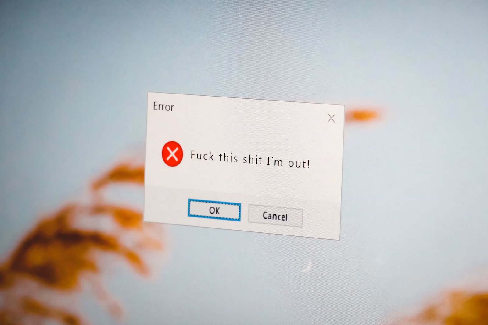
Failure is where trust is won or lost: meet it with honesty and a clear way forward and users will forgive almost anything; leave them stranded and a single error can undo a hundred smooth screens.
A good error message is quiet proof that someone was thinking about them on their worst moment.
When It Matters Most
- Money and security — declined payments, failed logins, anything that feels risky.
- Data loss — the instant a user fears their work is gone.
- Repeated failure — the second and third time it fails, your tone is everything.
The higher the stakes, the more a calm, useful sentence is worth.
What This Module Covers
Two ways to turn a breakdown into trust: helping people recover gracefully when something fails, and designing so the error never has to appear at all. The next articles show you how.
Error Recovery
A bad error message breaks the user's flow. Most apps act like a judge — "Invalid input" — pointing a finger and stopping there. Great error copy acts like a GPS: it acknowledges the wrong turn and immediately calculates a new route. That difference decides whether a stuck user pushes through or closes the app. It pays off at the end, too: by the peak-end rule, people judge an experience largely by how they recovered from its low points — an easy recovery makes the whole product feel more reliable. The effect is measurable: when Slack replaced vague "Something went wrong" messages with specific, self-serviceable ones, it reported an ~18% drop in related support tickets, and the Baymard Institute lists unclear error messages among the top causes of checkout abandonment.
Problem + Solution + Action
Every error should answer three things — acknowledge what broke, explain why, and hand over the exit:
- What happened — specifically
- Why it happened — if known
- What to do next — actionably, ideally with a button
- ❌ Judge: "Payment declined. Transaction cannot be completed."
- ✓ GPS: "Your bank declined the charge. Check your card details or try a different payment method. [Update card]"
For sensitive failures (payments, security), name the specifics: not "Payment failed" but "Your card ending in 4242 was declined. Contact your bank or try a different card." Stuck on the wording? Ask AI to draft three versions in the Problem → Solution → Action shape, then pick the clearest and make it true to your product.
Acknowledge Before You Instruct
Naming the user's frustration calms it, and sharing the blame keeps it from landing on them.
- Shopify writes "Looks like we missed a digit in your phone number" instead of "Input required" — human, and we missed it, not you.
- Mailchimp turns a block into reassurance: forget a subject line and it says "Wait! You're almost there — just add a subject line before you send," not a flat "Subject required."
Real-world recovery language works the same way: Google Maps says "Recalculating… make a U-turn in 500 feet," never "Wrong way!"; a flight attendant says "Try turning the bag sideways," not "Your bag is too big." Solution-first, not problem-only.
A short empathetic line carries the recovery: "We saved your work — no worries," or "Let's try that again. Your payment wasn't processed." It reassures before it instructs.
Avoid Worn-Out "Oops"
"Oops" became a trend in the 2010s to inject personality into errors; it's now worn out. In repeated-error situations — a failed payment, a login that keeps failing — it turns condescending and eats space that should carry useful information (Instacart's repeated "Oops" on search failures is the classic miss). The Vrbo anti-pattern opens "Oops… Unfortunately" — two waste words before the user learns anything. Front-load what happened, not the emotional framing. Use "Oops" only in low-stakes, clearly recoverable moments — never for financial, health, or security errors.