Building Your Portfolio Website with AI
You've done the hard part in Building a Design Case: the thinking, the case studies, the story. Now that work needs a home online. A PDF or a single Behance page rarely does your thinking justice - and a recruiter usually clicks your portfolio link before they read your CV. That link is the screen, so the site behind it has to open fast, look considered, and feel like yours.
Learn on the move: press play and turn your commute, walk or drive into time that grows your design career.
Listen to the full Building Your Portfolio Website with AI course on DesignPath
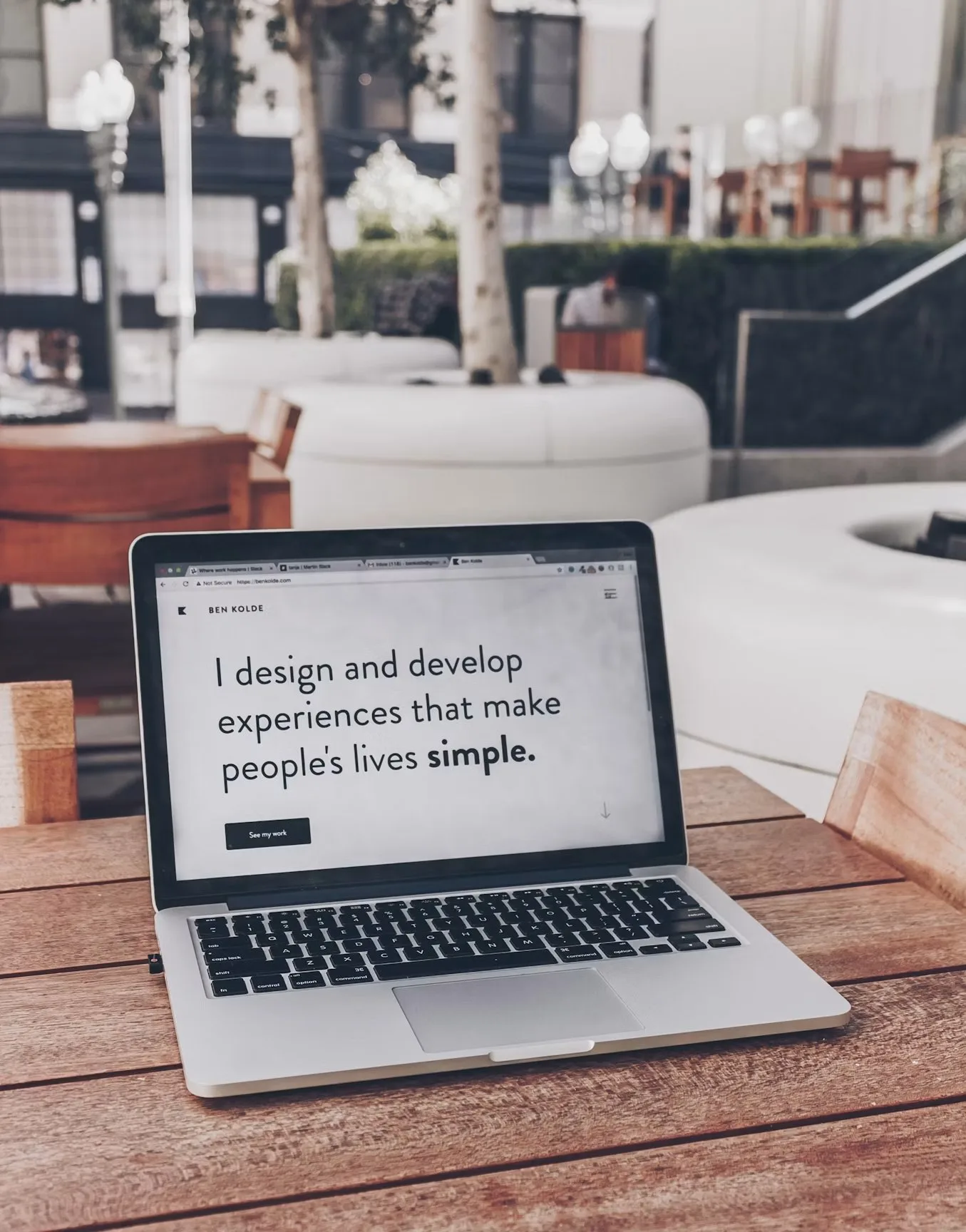
Here's the good news: you no longer need to hand-code from scratch or hire a developer. The best route for a designer is to write one detailed brief and hand it straight to Claude Code, which builds a real, functional site you own. There is no mockup stage, because the builder produces a working site in the time a picture would take. No-code tools like Framer are an option too, with trade-offs we'll get to.
This module walks the whole path, from writing the brief to shipping a fast, animated site people can actually visit.
What a Portfolio Site Needs
Before you pick a tool or write a brief, decide what the site actually needs to contain. A recruiter lands with one question - can this person do the job? - and about a minute to answer it. Most portfolio sites lose people here on shape rather than on visuals: the work is buried, there's no clear path to it, and the best project is three clicks deep. Get the structure right and even a plain site does its job.
The Essential Sections
A portfolio site needs a small, predictable set of parts. In rough top-to-bottom order:
- Hero: who you are and what you do, in one line - name, role, and a one-line pitch, with a way to reach the work straight away. The first screen has to answer "what kind of designer is this?"
- Selected work: the core of the site. Three to six projects, strongest first, each a clear card (thumbnail, title, your role, one-line outcome) that links to its case study. Curate hard - a few strong projects beat many weak ones.
- Case studies: the depth behind each project. The content of these - the story, the decisions - is covered in Building a Design Case; the site's job is just to present them cleanly and make them easy to open.
- About: a short, human paragraph - who you are, your focus, maybe a photo. Not a life story.
- Contact: email and links (LinkedIn, a CV download). Make it impossible to miss. A portfolio with no obvious way to reach you has missed its one job.
- Optional: a services section (for freelancers), a resume link, writing, and a footer with social links.
One Page or Many?
- One page - everything scrolls, case studies link out or expand. Fastest to build, fastest to read, and great for juniors or a focused body of work. Make this your default.
- Multi-page - a home page plus individual project pages and an about page. Worth it once you have several deep case studies or want each project to breathe.
The rule: start one-page, and grow to multi-page only when the content demands it. Don't build navigation you don't need.
Make the Path Obvious
- Lead with work, not a long intro - people came to see projects, so show them near the top.
- Strongest project first, by recency or relevance, the same way a CV leads with your best role.
- Every project card states an outcome, not just a pretty shot - "cut checkout drop-off 18%," not "checkout redesign."
- Keep navigation to a few clear items - Work, About, Contact. No more.
- One clear call to action per screen, and the best project reachable in a click or two from the top.
A Model One-Page Structure
A clean default you can hand straight to your builder as the skeleton:
Hero - "Jane Doe - Product Designer. I design clear flows for complex B2B tools." + [See work] [Contact]Selected Work - three project cards, strongest first; each with thumbnail, title, role, and a one-line outcome, linking to the case studyAbout - three or four sentences plus a photo; your focus and what you're looking forContact - email, LinkedIn, CV downloadFooter - social links
Get the shape right first, and the build stages that follow - designing the look, then having AI code it - have a clear target to hit. Beautiful visuals can't save a site a recruiter can't navigate; a well-structured one earns the click into your work.